- The Core Question: More study time doesn't always lead to higher scores. Your teaching intuition deserves to be backed by data.
- The Best Tool: A scatter plot is the perfect way to visualize the relationship between student effort and academic results.
- The Old Frustration: Calculating correlations (like the R-squared value) in Excel is too complex and time-consuming for most teachers.
- The AI Solution: Tools like Excelmatic let you upload a spreadsheet and get clear, analytical insights just by having a simple conversation.
As a teacher, you've likely had this conversation at a parent-teacher conference: "They're a very hard worker and spend hours on homework every night. Let's work on their study methods..."
And you've probably wondered to yourself: that top student in the class seems to grasp everything effortlessly, while another student works tirelessly into the night but their grades just don't improve.
Does more homework time really lead to better grades?
This question, on the minds of countless educators, is both a pedagogical puzzle and a data problem. Your gut feeling might tell you the answer is "not always," but a "gut feeling" doesn't carry much weight in a staff meeting or when presenting to parents. You need evidence.
The Traditional Frustration: Hitting the "Analysis Hurdle" in Excel
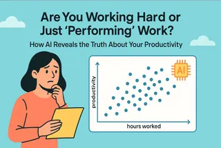
The most scientific way to test this hypothesis is with a scatter plot. The X-axis represents "Average Homework Time," the Y-axis is the "Final Exam Score," and each student is a single dot on the chart.
In theory, this is simple. The real challenge, however, is the next level of analysis: adding a trendline to see the overall direction of the data and, most importantly, calculating the R-squared value. This single number tells you how well "homework time" can actually predict or "explain" the final score.
In Excel, getting this done requires a frustrating series of right-clicks, menu-hunting, and checkbox-ticking. Many teachers give up after creating the basic chart, hitting an "analysis hurdle" that sends them right back to relying on intuition alone.
How AI Helps You Cross the Hurdle and Become a Data Analyst
Today, AI tools play a brand new role: your personal data assistant.
You no longer need to learn complex statistical concepts or software operations. You only need to do two things:
- Ask a question: Just like talking to a real assistant, tell it what you want to analyze in plain English.
- Understand the conclusion: The AI doesn't just create the chart; it performs the analysis and explains the findings in simple, clear language.
It elevates you from a tedious "chart-maker" to an insightful "analyst" who can guide instruction with data.
Your Personal Data Assistant: Excelmatic
Excelmatic is precisely this kind of data assistant, tailor-made for you. It's not a complex software you have to learn, but a smart partner that understands plain English.
- Core Features: Excelmatic helps you clean data (e.g., standardizing units), merge spreadsheets (e.g., combining class rosters), create charts, and perform intelligent analysis.
- How It Works: You upload your Excel file, type your question in the chat box, and it instantly delivers charts and conclusions.
- Pricing: It offers a free trial, with professional plans starting at just $9.9/month, making AI-powered data analysis accessible to every educator.
Excelmatic in Action: Test Your Hunch in 3 Conversational Steps
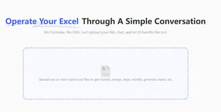
Step 1: Upload Your Class Data
Prepare a simple spreadsheet with at least two columns: "Average Homework Time" and "Final Exam Score."
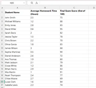
Then, just drag and drop the file into Excelmatic.
Step 2: Your First Prompt - Get a Visual Overview
Once the file is uploaded, ask the AI to create a basic chart to get a feel for the data's distribution. In the chat box, type:
"Plot 'Average Homework Time' vs 'Final Exam Score' as a scatter plot."
Step 3: Your Second Prompt - Quantify the Relationship
Now that you see the dots, you want to understand the pattern. Just continue the conversation, asking the AI:
"Add a trendline and the R-squared value."
Don't Understand R-squared? No Worries, Your Assistant Can Explain
Many teachers might see a statistical term like R² = 0.861 and worry, "What does this number even mean? How am I supposed to explain this to a parent?"
Don't worry at all! This is where the true value of Excelmatic as a "data assistant" shines. You can delegate the interpretation task directly to it. Simply continue the chat with one more question:
"What does this chart tell me?"
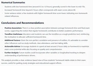
Now you have not only the chart but also a clear, citable conclusion.
Frequently Asked Questions (FAQ)
1. Q: What if my data is messy? For example, some students entered "1.5 hours" and others wrote "90 minutes."
A: That's a key strength of Excelmatic. Before creating the chart, you can simply tell it: "Standardize the 'Average Homework Time' column to hours." The AI will automatically clean and convert the data for you, saving you a huge amount of manual work.
2. Q: Can I use these charts in my PowerPoint slides or parent handouts?
A: Absolutely. All charts generated by Excelmatic can be easily exported as images. You can insert them directly into your presentations, reports, or materials for parents to present a professional, data-backed point.
3. Q: Is it safe to upload sensitive student data?
A: Yes. Excelmatic uses bank-level encryption and strict privacy protocols. Your data is used only for the real-time analysis you request. It is not saved by the platform or used for any other purpose, ensuring the complete security of your and your students' information.
From Gut Feeling to Hard Evidence: Make Your Teaching More Scientific
The next time a parent asks why their child is spending so much time studying but not seeing results, you'll no longer have to just say, "I have a feeling..."
You can pull up the chart you created with Excelmatic, complete with its clear conclusion, and say with confidence: "I've analyzed the data, and it shows that for our class, there isn't a strong link between more time spent and higher grades. Let's work together to look at their study efficiency and learning strategies instead."
This is data-driven teaching. It makes your professional experience more persuasive and empowers every conversation you have.
Start your free trial of Excelmatic today and test your first teaching intuition.


