- You need data to prove your hunches, not just a "gut feeling."
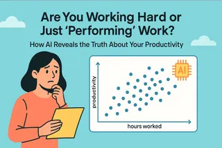
- A scatter plot is the best tool to see the relationship between two metrics.
- The analysis steps in Excel (trendlines, R²) are too complex for most users.
- AI lets you create and analyze a scatter plot with simple conversation.
During a meeting, your boss asks, "We spent a lot on social media ads this quarter. Did it actually work? Is there any connection to our daily active users (DAU)?"
Your stomach sinks a little. Your "business hunch" tells you the answer is yes. But "I think" is the weakest phrase in business. What you need is a chart—a chart that silences debate and lets the data speak for itself.
This is a job for a Scatter Plot. It's the tool that helps you make the critical leap from "guessing" to "proving."
The Scatter Plot: Your Business "Relationship Detector"
Forget the complex definitions. Think of a scatter plot as an "evidence board." You have two axes: the X-axis for "Ad Spend" and the Y-axis for "Daily Active Users." For each day, you plot a single dot representing the data (how much you spent, and how many users you got).
Once all the dots are on the board, the chart instantly tells you: is there a relationship between these two things?
- If the dots trend upwards and to the right, they likely have a positive correlation (the more you spend, the more users you get).
- If the dots are scattered randomly like stars in the sky, there's probably no relationship at all.
The Pain Point of Making a Scatter Plot: Why Is It So Hard in Excel?
Creating a basic scatter plot in Excel is easy, but that's only 10% of the job. The real analysis—proving how strong the relationship is—is where it gets difficult.
You need to add a "Trendline" and display a value called "R-squared" (R²). In Excel, this process involves a chain of clicks: Right-click -> Click -> Right-click again -> Click again -> Check a box... By the end, most people are completely lost.
And that's before you even try to understand what "R² = 0.85" means. Think of it as a "correlation score" from 0 to 1; the closer it is to 1, the stronger the relationship. But if you can't explain that, your chart loses half its power, and what should be strong evidence feels weak.
How AI Turns You from a Chart-Maker into an Analyst
AI tools completely change this experience. It's no longer a passive software waiting for your commands; it's an analysis partner that helps you think.
You no longer need to memorize complex click-paths. The AI does it all for you:
- Automated Charting: It creates the scatter plot based on your simple command.
- On-Demand Analysis: You ask, and it adds the trendline and R-squared value.
- Interpreted Results: It can even tell you what the chart means in plain English.
It frees you from the headache of "How do I build this chart?" and lets you jump straight to "What is this chart telling me?"
In Action with Excelmatic: From Excel Data to Insight in Two Simple Steps
Step 1: Upload Your Data
Prepare an Excel file with two columns of data. These columns should be the two variables you want to explore (for example, one column for "Ad Spend" and another for "Active Users").
Drag and drop this Excel file directly into Excelmatic.

Step 2: Generate the Basic Chart with a Simple Command
Once the file is uploaded, type the following command into the chat box. Remember to replace [Your Column Name] with the actual column titles from your Excel file.
“Create a scatter plot with ‘[Your Column Name 1]’ and ‘[Your Column Name 2]
Step 3: Ask a Follow-up Question to Get the Deep Analysis
After the basic chart appears, simply ask a follow-up question to get the professional analysis:
“Add a trendline and the R-squared value.”
FAQs: Common Questions About AI-Made Scatter Plots
1. Q: Will the AI tell me if there's no relationship between the variables?
A: Yes. If the data points are very scattered, the R-squared value will be low (e.g., below 0.3). This is also a valuable insight, as it can stop you from making decisions based on a false hunch. You can even ask, "What does this mean?" and it will tell you the correlation is weak.
2. Q: Can I analyze three or more variables at the same time?
A: A 2D scatter plot is designed to analyze the relationship between two variables. If you want to explore more, you can use the AI to run multiple pairwise comparisons. For example, first analyze "Ad Spend vs. DAU," then "Number of Posts vs. DAU."
3. Q: What's the difference between a scatter plot and a line chart? I always get them confused.
A: Great question. A simple way to remember: a line chart is typically used to track one metric over time (e.g., your DAU a for the last 30 days). A scatter plot is used to see if there's a relationship between two different metrics (e.g., Ad Spend and DAU), and it doesn't necessarily involve a time dimension.
Make Decisions with Data, Not Just a Feeling
In the business world, one data-backed insight is worth a thousand "gut feelings."
A scatter plot is a powerful tool to help you build that "data intuition." AI removes all the barriers to using it, allowing you to quickly and confidently test your hypotheses and make smarter decisions.
Try Excelmatic for free today, and turn your business hunches into a data-backed report.


