In This Article
- Your Dilemma: You have a dozen tasks in your head, but the thought of creating a Gantt chart in Excel is exhausting, especially when plans change.
- The Value of a Gantt Chart: It turns a chaotic stream of consciousness into a clear project roadmap, showing everyone "who, what, and when."
- The Real Pain Point: A Gantt chart made in Excel is a static image. Adjusting it is a painful manual process, essentially just grunt work.
- The AI Difference: Simply upload your Excel list and use plain English commands. The AI builds and dynamically adjusts the Gantt chart for you.
Does this sound familiar?
You’ve just been put in charge of a "project"—maybe it's a major marketing campaign or a quarterly hiring drive. Suddenly, your mind and notebook are flooded with tasks: write ad copy, design the landing page, contact influencers, schedule interviews, run the ads…
Everything is a jumble. You desperately need a plan, a timeline that everyone on the team can understand. The term "Gantt chart" floats into your mind, quickly followed by a wave of exhaustion—oh God, not the Excel grid again.
Why Does Everyone Talk About Gantt Charts?
Let's be honest: if they weren't genuinely useful, no one would bother with them. A good Gantt chart acts as your project's "roadmap," and it delivers three immediate benefits:
- Clarity at a Glance: All tasks, owners, and start/end dates are laid out on a single timeline. No one has to ask, "So, when do I start my part?"
- Clear Ownership: It’s perfectly clear who is responsible for what, which prevents finger-pointing later.
- A Glimpse into the Future: You can instantly see which tasks are dependent on each other. When one step is delayed, you can immediately foresee the domino effect on the entire project.
In short, it transforms your mental chaos into a shared action plan for the entire team.
So, Why is Making One Such a Headache?
The problem isn't the Gantt chart itself; it's the traditional way of making it. For the vast majority of us who aren't certified Project Managers, the "Excel Gantt chart" is the only option, and its pain point is debilitating.
Making a Gantt chart in Excel is pure manual labor.
You use stacked bar charts and carefully set up your dates and task bars. It looks like a Gantt chart, but it's just a static picture with no intelligence. The moment your project begins, any small change—the designer needs two more days for the creative—forces you to perform surgery on your spreadsheet, manually adjusting the start dates of all subsequent tasks. With more than a few tasks, this is a nightmare.
The end result: You're not managing a project; you're maintaining a picture. And that picture quickly becomes outdated and useless.
The Game Changer: How AI Makes Your Gantt Chart "Live"
Now, let's try a different approach. What if creating a Gantt chart was a conversation, not a chore?
AI charting tools completely change the game. It’s not a complex piece of software you need to learn; it's an intelligent assistant that understands your intent.
You no longer have to worry about cell formatting, date functions, or chart settings. All you have to do is tell the AI what you want. It can:
- Read and understand your simple Excel task list.
- Automatically generate a timeline and place your tasks correctly.
- Dynamically adjust the entire schedule based on a single command. This is the magic.
It handles all the tedious grunt work, allowing you to focus on the project itself.
In Action: Turn Your Excel List into a Gantt Chart in 3 Steps
Let's use a classic "marketing campaign" scenario to see how Excelmatic makes this happen.
Step 1: Prep a Simple Excel Task List
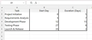
You don't need any special formatting. Just open Excel and list your tasks and owners like you normally would. For example, you create a file named "Campaign_Plan.xlsx" with just three columns:
| Task | Start Day | Duration (Days) |
|---|---|---|
| Project Initiation | 0 | 5 |
| Requirements Analysis | 5 | 7 |
| Development Phase | 12 | 15 |
| Testing Phase | 27 | 8 |
| Launch & Release | 35 | 3 |

Step 2: Upload Your Excel File, Then Give a Single Command
Open Excelmatic and simply drag-and-drop your "Campaign_Plan.xlsx" file into the upload area.
Once the file is uploaded, tell the AI your plan in the chat box. This is where the magic happens: the AI reads your Excel content and combines it with your command.
"Read this Excel and create a Gantt chart from the 'Task' column. The project starts next Monday, and make each task 5 days long."
Step 3: Adjust Your Plan Like You're Sending a Chat Message
The AI has created a first draft. Now, when plans inevitably change, you can adjust with natural language:
"Urgent update: The 'Contact channel partners' task needs to be delayed by 3 days."
Notice what just happened. You didn't touch a single chart setting. Adjusting your plan is no longer a painful manual task; it's a simple conversation. Once you're happy, click download, and a clean, accurate Gantt chart image is ready to be shared.
FAQs: Common Questions About AI-Powered Gantt Charts
1. Q: Can I assign owners to each task?
A: Absolutely. You can either include an "Owner" column in your initial Excel file (which the AI will read automatically), or you can tell it in a follow-up command: "Assign the 'Write blog posts' task to @Ben."
2. Q: What if I have no idea how long each task will take?
A: No problem. You can start by just defining the task order and dependencies to create a structural outline. Or, you can be bold and ask the AI: "Based on a typical marketing plan, give me a standard time estimate for these tasks." It will provide a great starting point.
3. Q: How does this compare to professional PM software like MS Project?
A: It's about a different focus. AI tools like Excelmatic are designed to be lightweight and fast, solving 90% of everyday project planning needs and getting you from zero-to-one in minutes. They are not built for ultra-complex engineering projects with resource cost accounting. For most "accidental project managers," an AI tool is the perfect place to start.
You Should Be Managing the Project, Not the Chart
As the person in charge, your value comes from communicating, coordinating, and driving progress—not from wrestling with spreadsheet cells.
AI tools give you a choice: outsource the repetitive, frustrating charting work to an intelligent assistant, and free up your valuable time for the work that truly matters.
Try Excelmatic for free today, and experience the relief of turning a messy list of ideas into a crystal-clear roadmap, just by having a conversation.


