Key Takeaways
- The Decision Dilemma: Making calls based on averages alone is risky. Error bars are the scientific way to judge the 'reliability' of your A/B test results.
- What Error Bars Mean: They visualize data's variability. If the error bars of two options overlap significantly, their difference could just be random chance.
- The Old Way is Painful: Creating error bars in Excel requires manual statistical calculations (like standard error), a process that is tedious and prone to mistakes.
- The AI Advantage: Modern AI tools let you bypass all complex calculations. Use a single, plain-English command to generate a professional error bar chart directly from your raw data.
You just wrapped up a week-long A/B test for a new ad campaign. You pull the data: Variant A has an average click-through rate (CTR) of 2.1%, while Variant B has a 2.5% CTR.
Variant B looks like the winner. You’re excited to tell your boss and recommend switching everything to B. But then a thought crosses your mind: "Is that 0.4% lead just dumb luck? If we ran the test again, would we get the same result?"
This question is the key to good data analysis. Making a decision on a small difference in averages is no better than flipping a coin. You need a more scientific tool to determine if your result is "significant"—and that tool is the Error Bar Chart.
The "Pain" of the Traditional Method
That little "T" shape on top of a bar in a chart is the error bar. It represents the uncertainty or variability in your data. If the error bars for Variant A and Variant B overlap, it means their performance difference might be due to random noise. If they don't overlap at all, you can confidently say that one is significantly better than the other.
But creating an error bar chart in Excel is a real test for most business users:
- The Calculation Barrier: First, you have to manually calculate the mean (average) and standard error for each variant. This means wrestling with functions like
AVERAGE,STDEV.S,COUNT, andSQRT. One mistake in your formula, and the whole chart is wrong. - The Clicks Maze: After you create a basic bar chart, you have to navigate a sea of menus: "Add Chart Element" -> "Error Bars" -> "More Error Bar Options." Then, in a complex panel, you must manually link the custom error values you just calculated.
- The Mental Overhead: The entire process is filled with doubt. Is my formula right? Did I select the correct option? This friction causes many people to skip this crucial step and just present a simple, and potentially misleading, bar chart.
A More Efficient Way: What Are AI Charting Tools?
Now, imagine you could give the raw data (e.g., daily impressions and clicks) directly to an AI and simply say:
“Compare the average click-through rates for variants A and B, and plot the results as a bar chart with error bars.”
This is the revolution AI charting tools bring. They are tools that understand your analytical intent. You don't need to know the statistical formulas or memorize the steps. You just describe the "final picture" you want in plain English, and the AI automatically handles:
- Grouping and aggregating the data.
- Calculating the mean, standard error, and other stats.
- Calling the right charting libraries and applying the data.
- Generating a clean, presentation-ready chart.
It transforms a 20-minute struggle into a single question.
How to Choose Your AI Charting Assistant: 5 Tools Compared
Many tools now feature AI capabilities, but they have different strengths. We've selected five representative tools to help you find your best fit.
1. Excelmatic
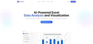
Designed for non-technical business users, it seamlessly integrates data processing and charting. In a single conversation, a user can clean data, calculate metrics, and then immediately ask the AI to create complex charts like error bars or dual-axis plots based on the results.
- Best For: Marketing, operations, and sales professionals who need to perform data analysis and create reports efficiently in their daily work.
- Pricing: Offers a free trial; premium plans start at $9.9/month.
2. ChatGPT (with Advanced Data Analysis)

The king of general-purpose AI. As long as you can describe your request clearly, it can generate almost any chart type by writing Python code (using libraries like Matplotlib or Seaborn). The process may require a few rounds of refinement.
- Best For: Tech-savvy users or data analysts who understand some basic programming concepts and want a powerful, all-in-one AI assistant.
- Pricing: Requires a ChatGPT Plus subscription, around $20/month.
3. Julius AI

A platform that combines conversational AI with a data science notebook, offering strong support for charting. It excels at exploratory data analysis and can generate high-quality visualizations, also based on code generation.
- Best For: Students, researchers, or data scientists who want to use conversational AI for in-depth data exploration and visualization.
- Pricing: Offers a free trial; premium plans start at $16/month.
4. Tableau

A giant in the professional Business Intelligence (BI) space. Its AI features (like "Ask Data"/Einstein) allow users to generate charts using natural language questions. It's more focused on exploration within a dashboard environment than generating single, exportable charts.
- Best For: Business analysts and data teams already using Tableau in a corporate environment who want to lower the barrier to creating visualizations.
- Pricing: Starts around $35/month for its Creator plan (often billed annually), with higher prices for enterprise use.
5. Microsoft Copilot for Excel

A deeply integrated AI assistant within Excel itself. It can help you understand data, suggest formulas, and create charts. Its ability to generate complex charts like error bars from a direct command is still evolving but has enormous potential.
- Best For: Heavy users of the Microsoft Office suite who want AI assistance directly within their familiar Excel environment.
- Pricing: Requires an additional subscription; around $30/month on top of a Microsoft 365 Business plan.
Excelmatic in Action: Create an A/B Test Error Bar Chart in 3 Steps
Let's use Excelmatic to demonstrate how to get from raw data to a presentation-ready error bar chart.
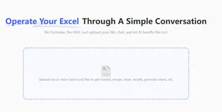
Step 1: Upload Your Raw Data
Upload the spreadsheet or CSV file containing your daily campaign data. It should have columns like 'Date', 'Variant ID', 'Impressions', and 'Clicks'.
Step 2: Give a Command with Your "Intent"
In the chat box, tell the AI your final analytical goal. It will handle all the intermediate calculations for you.
“Group by 'Plan ID', calculate the average CTR (clicks / impressions), then plot a bar chart to compare them, and add error bars.”
Step 3: Refine and Download the Chart
The AI-generated chart is almost ready. If you want to perfect it, just keep the conversation going:
“Add a title to the chart called 'A/B Test CTR Comparison' and change the color of the bar for Variant A to yellow.”
Once you're happy, just click download. A professional chart, ready for your PowerPoint slide, is now yours.
FAQs: Common Questions About AI-Generated Error Bars
1. Q: I don't know any statistics. Are the AI-generated error bars reliable? What standard does it use?
A: Yes, they are reliable. That's the value of an AI tool. It automatically uses the most common and standard statistical method—calculating the Standard Error—to represent the reliability of the mean. You don't need to worry about the complex formula, you just need to know how to interpret the result: the shorter the bar, the more trustworthy the result.
2. Q: Can I change the axis labels or colors after the chart is created?
A: Of course. A good AI tool allows for chart beautification and modification through follow-up questions. You can give commands just like you're directing a designer, such as "Change the Y-axis title to 'Average CTR'" or "Make the color for Variant B more prominent."
3. Q: What if my data is messy, with blank cells or errors?
A: No problem. Before creating the chart, you can ask the AI to clean your data first. For example, you could start with the command, "Check for any empty cells in the data and fill them with 0." Once the data is clean, you can proceed with the charting command. The power of AI lies in its ability to handle the entire data workflow in one place.
Make Decisions with Data, Not Gut Feelings
Error bars are the scientific tools that help us see through the 'fog' of data to find the truth. In the past, they were underutilized because they were too difficult to create.
Now, AI tools have changed the game. They empower you to focus on the business question, not get bogged down by complex software and statistical formulas.
Try Excelmatic for free today. The next time you analyze an A/B test, present your boss with a chart that shows not just a conclusion, but also confidence.


