Key takeaways:
- A dual-axis chart is the best way to visualize two different data series with different scales (e.g., Revenue in dollars and Growth Rate in percentages) on a single chart.
- Creating a dual-axis chart manually in Excel involves multiple steps and is prone to error, especially when setting the secondary axis.
- AI data tools use Natural Language Processing (NLP) to simplify this complex process into a single command, dramatically improving efficiency and accuracy.
Your data has a story to tell. But telling that story effectively can be challenging, especially when you need to show the relationship between two very different metrics. Imagine presenting your monthly sales report: you want to show both the absolute revenue growth and the percentage growth rate on the same chart.
How do you present two different data dimensions elegantly so your audience gets the message instantly? The dual-axis chart is the perfect tool for the job. But creating one is a common pain point for many professionals.
This article will guide you through the world of dual-axis charts, compare two vastly different creation methods, and help you find the solution that works best for you.
What is a Dual-Axis Chart & Why Is It Tricky?
A dual-axis chart, or a combination chart, features two Y-axes: a primary axis on the left and a secondary axis on the right. This allows it to display two data series that have significantly different numerical scales.
- Example: The primary axis (left Y-axis) can show "Revenue" in thousands of dollars, while the secondary axis (right Y-axis) shows "Growth Rate" as a percentage.
The reason it’s tricky is that traditional spreadsheet software like Excel wasn't inherently designed for this "split-focus" scenario. You have to manually instruct the software which data series belongs to which axis and how each should be visualized. This process involves navigating multiple settings menus, and it's easy to get lost in the options.
Method 1: The Manual Path with Excel
Let's walk through the standard procedure for creating a dual-axis chart in Excel to understand the complexity involved.
- Prepare Data & Insert Chart: Select your data range, then click
Insert->Recommended Charts->All Charts->Combo. - Choose Chart Types: For each data series, you must specify a chart type. For our example, we'll choose
Clustered Columnfor "Revenue" andLine with Markersfor "Growth Rate." - [The Critical Step] Set the Secondary Axis: In the same setup window, find the "Growth Rate" series and manually check the "Secondary Axis" box to its right. This is the core of the operation and the most frequently missed step.
- Add Chart Elements: Once the chart is generated, you need to manually add and edit the main chart title, the primary axis title (Revenue), and the secondary axis title (Growth Rate).
- Format and Refine: Finally, adjust the legend, colors, line thickness, and other cosmetic elements to meet professional reporting standards.
This entire process requires a clear understanding of Excel's charting functions and careful attention at each step. Typically, creating one presentation-ready dual-axis chart takes about 15 minutes.
Method 2: How AI Understands Your Request
In contrast to the manual method, AI-powered data tools offer a new mode of interaction: conversational charting.
This works by using Natural Language Processing (NLP). When you type a command in plain English, the AI acts like an expert data assistant, "translating" your request into a series of precise, machine-executable steps in the background.
Your Prompt: "Create a dual-axis chart. Use 'Revenue ($K)' as a column chart on the primary axis and 'Growth Rate (%)' as a line chart on the secondary axis."
The AI's Process:
- Identify Intent: The AI recognizes the core request is a "dual-axis chart."
- Break Down Tasks:
- Task 1: Find the "Revenue ($K)" data, set it as a
Column Chart, and associate it with thePrimary Y-Axis. - Task 2: Find the "Growth Rate (%)" data, set it as a
Line Chart, and associate it with theSecondary Y-Axis.
- Task 1: Find the "Revenue ($K)" data, set it as a
- Execute Automatically: The AI simulates all the manual clicks and settings, then instantly generates the final chart.
Let's see this new method in action using Excelmatic, a modern AI charting tool:
Step 1: Upload Your Data File Drag and drop your Excel spreadsheet containing the sales data into the upload area.
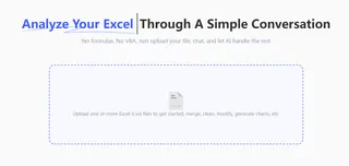
Step 2: Give Your One-Line Command In the chat box, simply type what you want to see.
"Create a dual-axis chart. Use 'Revenue ($K)' as a column chart on the primary axis and 'Growth Rate (%)' as a line chart on the secondary axis.
The entire process requires you to do one thing: state your intention.
Recommended Tools for Creating Advanced Charts
While Excel is a common tool, several others specialize in data visualization. Here are three representative choices.
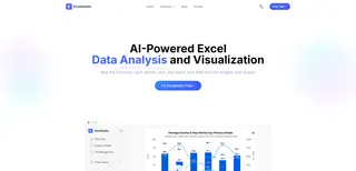
- Excelmatic
- Description: A conversational AI data analysis tool. Its core advantage is its ability to handle everything from data processing to complex chart generation (like dual-axis, waterfall, or Sankey charts) through natural language, requiring almost no learning curve.
- Best For: Business professionals (marketing, sales, operations) who need to create reports frequently but don't want to learn complex software.
- Pricing: Offers a free tier for basic use; premium plans typically start around $10-$20 per month.
- Tableau
- Description: A leading business intelligence (BI) and data visualization platform. It is extremely powerful and can create highly interactive dashboards. Creating a dual-axis chart is done by dragging and dropping fields and clicking menu settings.
- Best For: Professional data analysts, BI engineers, and enterprise users who need deep data exploration capabilities.
- Pricing: Expensive, typically licensed per creator on an annual subscription basis, costing several hundred to over a thousand dollars per year.

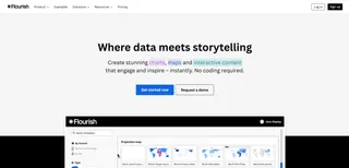
- Flourish
- Description: An online tool focused on narrative-driven data visualization. It offers a wide range of beautiful, animated chart templates ideal for news articles, blog posts, and public presentations.
- Best For: Journalists, designers, and content creators who have very high standards for visual appeal.
- Pricing: Offers a limited free version (with a watermark); paid plans start at around $19/month.
FAQs: Using AI to Create Dual-Axis Charts
1. Q: What if my data isn't clean? For example, if my growth rate is text like "15.2%". Can the AI handle that?
A: Yes. Before creating the chart, you can use a command to clean the data first. For example, you could say: "In the 'Growth Rate (%)' column, remove the percent sign and convert it to a number." The AI will preprocess the data to ensure the chart is generated correctly.
2. Q: Can I customize the colors or styles of an AI-generated dual-axis chart?
A: Yes. After the chart is generated, you can continue the conversation to make adjustments. For example: "Change the color of the column chart to blue," or "Make the line on the line chart thicker." You can also download the chart image or source data to refine it in other software.
3. Q: Besides dual-axis charts, what other complex charts can it make that are difficult in Excel?
A: You can use the same simple process to ask the AI to generate waterfall charts (for analyzing contributions), Sankey diagrams (for analyzing flow), and heatmaps (for analyzing distribution), all of which require complex workarounds in Excel.
Let the Tool Work for You, Not the Other Way Around
The key to effective charting is to focus on the insights you want to communicate, not on the complex steps required to operate the software. In the age of AI, you can dedicate your brainpower to thinking about what the chart should say, not how to build it.
Try Excelmatic for free today and experience the power of replacing multi-step processes with a single command. Make your next data presentation more efficient than ever.


