- Managers want to see the relationship between different data a a single chart, a task that's complex and time-consuming with traditional tools.
- Tools like Excel require a manual, multi-step process (e.g., changing chart types, configuring axes), shifting focus from analysis to operation.
- AI tools change the process from "how-to" instructions to "what-for" goals. You state what you want to see, and the AI builds it.
- This article walks you through a simple two-step workflow—"upload data → give one-sentence command"—to instantly create a "total vs. focus" combo chart.
Why Use AI for Your Charts?
Have you ever been in this situation? You're in a weekly performance review, presenting a chart of the company's overall revenue growth. Your director leans in and asks, "This is good, but what about our new hero product? I want to see its sales trend on the same chart. Is its growth actually driving the overall numbers?"
This is where true analysis begins. What your manager is really asking for isn't just a chart; they want to understand the relationship behind the data.
The problem is, the answer is stuck. It's not because you don't have the data—it's right there in your spreadsheet. It's because the time and steps required to visualize it with a traditional tool create a delay. This is precisely the gap that AI charting tools are designed to close: the gap between data and immediate insight.
The Bottleneck of Traditional Charting: When the Tool Limits Your Thinking
To create a "column + line" combo chart in Excel, you have to mentally map out a procedure and then execute it perfectly:
- Insert a Basic Chart: Select your data and insert a standard chart.
- Change Chart Type: Right-click the chart, navigate through menus to find "Change Series Chart Type."
- Assign Types Manually: In the "Combo" tab, you must individually assign "Clustered Column" to one data series and "Line with Markers" to another.
- Configure a Secondary Axis (if needed): If the data scales are different, you have to manually enable and format a secondary axis for one of the series.
- Format and Adjust: Finally, you spend time adjusting the title, legend, colors, and labels to make it presentation-ready.
The primary issue with this process is that it forces you to switch from high-level thinking ("What story am I trying to tell?") to low-level operations ("Which button do I click next?"). Once your analytical flow is interrupted by mechanics, the momentum is lost.
What Is an AI Charting Tool? A New Way of Working
An AI charting tool like Excelmatic represents a fundamental shift in workflow. It changes the process from telling the software how to do something to telling it what you want to achieve.
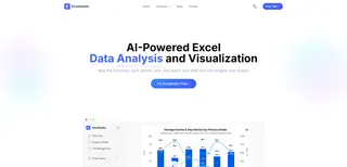
Think of it as a smart data analyst who understands your business goals. You are no longer an operator who needs to remember formulas and menu locations; you are a strategist who states the objective.
This shift delivers three immediate benefits:
- Speed: What took minutes of clicking is now accomplished in seconds of typing.
- Intelligence: It automatically handles complexities like secondary axes, making advanced charts accessible to everyone.
- Interaction: You can refine your chart conversationally, with follow-up commands like "add data labels to the columns" or "change the line color to orange."
A Practical Guide: Three Steps to Build Your Combo Chart
Let's revisit the meeting scenario and see how easily you can solve the problem with an AI tool.
Step 1: Upload Your Data Sheet
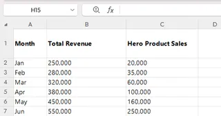
All you need is a simple spreadsheet with columns like Date, Total Revenue, and Hero Product Sales.
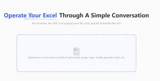
Click "Upload Files" and select this spreadsheet in Excelmatic.
Step 2: State Your Analytical Goal
Once the file is uploaded, simply type your objective into the chat box:
Create a combo chart using 'Total Revenue' as columns and 'Hero Product Sales' as a line.This command is a direct translation of your analytical goal.
Step 3: Get the Chart, Interpret the Insight
The chart is generated instantly. With it, you can clearly see the data relationship:
- Overall Trend: The columns show the general trajectory of total revenue.
- Product Performance: The line reveals the specific growth curve of the hero product.
By comparing the slope of the line to the trend of the columns, you can answer your director's question on the spot, backed by clear, visual evidence.
Frequently Asked Questions (FAQ)
1. Q: My sales data is confidential. Is it safe to upload it to the platform?
A: We understand this concern completely. Excelmatic uses industry-standard security protocols to ensure your data is encrypted and isolated. Your data is never used for any purpose other than fulfilling your requests, and you have full control to delete all uploaded files and history from your account at any time.
2. Q: What if my data sheet has blank cells or inconsistent formatting? Will the AI fail?
A: That's an excellent question. The AI is designed to handle the realities of imperfect data. It can automatically process common issues like blank cells (by ignoring them in calculations, not by producing an error) and can often understand columns with slightly different names. Its fault tolerance is generally higher than manual processes.
3. Q: Can I download the charts to use in my PowerPoint presentation?
A: Absolutely. This is a core feature. All charts can be downloaded with a single click as high-resolution images (e.g., PNG), ready to be dropped directly into your slide deck, report, or email. The processed data tables can also be downloaded as Excel files for your records.
Focus on Analysis, Not Operations
The purpose of a good tool is to increase your efficiency, allowing you to spend more time on what matters: interpreting data and thinking about your business.
Try Excelmatic for free and experience the shift from being a chart-builder to a data-storyteller.


