Key takeaways
- A sales manager needs to create a bar chart summarizing team performance from a raw sales data export before a meeting.
- Creating this chart in Excel requires multiple manual steps involving PivotTables, data selection, and chart formatting.
- AI-powered tools like Excelmatic allow users to upload the raw data and generate the final chart with a single, natural-language command.
You're a sales manager, and your weekly team sync is in ten minutes. You have just pulled a raw sales report from your CRM (like Salesforce or HubSpot) into an Excel file. It contains columns for each sales representative, deal value, and region. Your objective is to immediately generate a bar chart that summarizes total sales by each representative to discuss performance.
This is a standard business intelligence task. However, the process of converting that raw data into a presentation-ready visual often creates an efficiency bottleneck.
The Bottleneck of Manual Chart Creation
To accomplish this task in Excel, a user must follow a precise sequence of manual operations:
- Open the Excel file and select the entire data range.
- Navigate to the "Insert" tab and select "PivotTable."
- In the new worksheet, drag the "Sales Representative" field into the "Rows" area.
- Drag the "Deal Value" field into the "Values" area, ensuring it is set to "Sum."
- Select the summarized data within the PivotTable.
- Navigate back to the "Insert" tab and select a 2D Bar Chart.
- Finally, manually edit the chart title to something like "Monthly Sales Performance" and potentially adjust colors or axis labels for clarity.
The central issue with this workflow is that it requires the user's focus to be on software operation mechanics, not on the business question the data is meant to answer.
How AI Charting Tools Work
An AI charting tool, such as Excelmatic, introduces a fundamental shift in the user interaction model. It moves the process from "the user specifies how to perform each step" to "the user specifies what final outcome is needed."

The user does not need to know about PivotTables or chart menus. Instead, they provide a text instruction—a declarative command—that describes the desired analysis and visualization.
This approach delivers two key results:
- Efficiency: It reduces a multi-minute manual process to a fully automated workflow that completes in seconds.
- Accessibility: It removes the technical barrier, enabling any employee, regardless of their Excel proficiency, to perform rapid data visualization.
How to Create a Sales Performance Leaderboard with One Sentence
Let's revisit the initial scenario and demonstrate the AI-powered workflow.
Step 1: Upload Your Data File
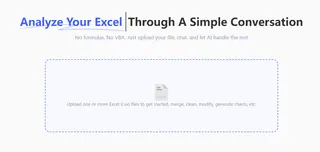
In the Excelmatic web application, directly upload your raw sales report (.xlsx or .csv).

Step 2: Generate the Chart with a Single Command
Once the file is uploaded, type a command in the chatbox that includes your full analytical intent:
Create a bar chart showing total sales by representative, and sort them from highest to lowest.
Step 3: Download the Chart
The AI will immediately generate the sorted bar chart.
You can then right-click to save the image (as a PNG file) for direct use in your PowerPoint presentation, email, or Slack channel.

Frequently Asked Questions (FAQ)
1. Q: Our sales data is confidential. Is it secure to upload to a cloud platform?
A: Data security is our top priority. The files you upload are used solely to process your request and are not stored permanently on our servers. Excelmatic uses industry-standard encryption to protect your data both in transit and during processing.
2. Q: Can I customize the chart's appearance, like changing the title or colors?
A: Yes. After the chart is generated, you can refine it with follow-up commands in the chat. For example, you can type: "Change the chart title to 'May Sales Leaderboard'" or "Change the bar color to blue."
3. Q: What if my raw data is messy, with extra spaces or inconsistencies?
A: You can handle this within the same session. First, issue a command to clean the data (e.g., "Trim whitespace from all cells"). Once the AI confirms the data is cleaned, you can then issue your charting command.
Focus on Insights, Not Configuration
The purpose of a tool is to increase productivity. When the process of chart creation is automated by AI, you can dedicate your time to what matters: interpreting the insights the data reveals.
💡 Try Excelmatic for free and experience an automated data analysis and visualization workflow.


