Bar charts (Bar Chart or Column Chart) are one of the most commonly used chart types in data visualization📊, intuitively displaying comparisons, trends, and distributions of various data. In daily work, whether it's sales reports, financial analysis, or project progress reports, bar charts are essential tools.
Presenting data with bar charts is simple and easy to understand, but the creation process is inevitably troublesome: manually adding labels, adjusting styles, handling data updates, etc., are all prone to errors and consume a lot of time.
What if your boss suddenly gives you new data to add to the table, with a short deadline and tedious tasks, worrying you won't make it in time?
Don't worry, the emergence of AI tools makes everything easy✨.
Excelmatic, this Excel data processing tool, easily solves your troubles. Just upload the file and send your requirements, and in a few seconds, it can generate a bar chart, automatically adding labels and formats, making data visualization more efficient and professional.
The Key Role of Chart Labels in Data Visualization
In bar charts, chart labels are the core for understanding data🔍. Labels not only display values but also help readers quickly compare differences between different categories.
The important roles of labels:
- Enhance readability: Through labels, the audience can directly obtain numerical information without reading the axes.
- Improve decision-making efficiency: Clear labels allow managers to quickly spot outliers or trend changes, supporting rapid decisions.
- Highlight key data: For example, marking the highest or lowest values makes the chart more informative.
Without labels, bar charts can easily confuse people, especially with large data volumes or many categories. Manually adding labels is not only troublesome but also error-prone.
Traditional Bar Chart Creation Steps and Pain Points
In Excel, manually drawing bar charts usually includes the following steps:
- Select data: Choose the data range to display.
- Insert bar chart: Click "Insert" → "Bar Chart," select the appropriate style.
- Add labels and adjust formats: Manually add labels for each data point, adjust colors, fonts, bar widths, etc.
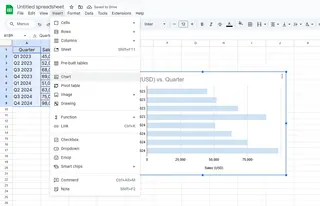
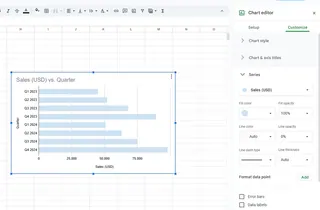
Although the steps are simple, there are some issues in actual operation⚠️:
- When data updates, the chart needs to be modified repeatedly, easily leading to omissions.
- Manually adjusting labels for multi-category data is time-consuming and laborious.
- Inconsistent formats may make reports unattractive and unprofessional.
These pain points make traditional bar chart creation both time-consuming and error-prone, especially for scenarios requiring frequent data updates.
How AI Simplifies Bar Chart Creation and Label Addition
AI can generate bar charts with one click and automatically add clear labels, making data visualization fast and accurate🚀.
The steps to generate bar charts using Excelmatic are very simple:
- Upload data: Upload your Excel or Google Sheets file to Excelmatic.
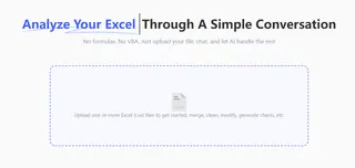
- Describe needs: Enter requirements in the natural language box, for example: "Generate a bar chart showing sales by quarter, and automatically add data labels."

- AI automatic generation: Excelmatic will automatically recognize the data, generate the bar chart and add labels, while optimizing colors and formats to make the chart beautiful and professional.
Excelmatic's advantages:
- One-click generation: No need for manual data or label operations.
- Automatic label addition: Ensures each bar's value is clearly visible, avoiding manual omissions or errors.
- Real-time updates: After data updates, the bar chart and labels refresh automatically, eliminating repetitive operations.
- Professional formats: AI automatically optimizes bar chart styles, making reports more professional and easy to read.
Tips to Enhance Bar Chart Visualization Effects
Although AI can automatically generate charts, you can combine the following methods to enhance chart effects based on needs💡:
- Adjust label positions: Ensure labels do not obscure bars, guaranteeing visual clarity.
- Personalize colors: Customize colors based on company brand colors or data categories.
- Highlight key bars: Emphasize important data through colors or shadows, making information clear at a glance.
Combining AI automation with manual optimization, bar charts are both quickly generated and aesthetically pleasing to read.
Still manually drawing bar charts? Try Excelmatic👉Try Now, let AI help you quickly generate professional bar charts, automatically add labels, and improve data visualization efficiency!

