Key Takeaways:
- The Pain Point: Traditional Excel chart creation is time-consuming, format adjustments are tedious, and repetitive tasks dominate your workflow.
- The Bottleneck: Merging multiple data sources and ensuring chart consistency is prone to errors when done manually.
- The Solution: Excelmatic's AI charting feature understands semantic intent and automatically matches chart types with appropriate styling.
- The Benefit: Transition from being a "chart adjuster" to an "insight analyst," boosting both personal and team decision-making efficiency.
The Monday Morning Scenario: When Chart Creation Steals Your Time
It's 9 AM on Monday. The Marketing Director suddenly needs a comparison chart of last month's channel performance. You open Excel, faced with a dozen data tables from different sources—all formatted inconsistently. You start manually merging, filtering, and adjusting formats... 3 hours later, you finally produce a 'barely acceptable' bar chart, only to realize the meeting has already ended.
If you're in marketing, e-commerce, operations, or running a business, this scenario is all too familiar. Chart creation—meant to communicate insights—often becomes a time-consuming "black hole" that drains your creativity and productivity.
The Old Way: Manual Chart Creation Steps That Drive You Crazy
Old Way (Traditional Excel):
- Select range A1:C10 → Insert → Chart → Choose bar chart
- Right-click → Select Data → Manually add data series
- Adjust colors, fonts, label positions, axis ranges
- Copy-paste into PowerPoint → Realize formatting is broken → Readjust
- Your boss says, "Can we try a pie chart instead?" → Start over from scratch...
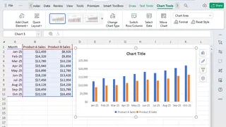
This process is repetitive, mechanical, and error-prone—while the real work of analyzing data and extracting insights gets pushed aside.
The New Era of Smart Visualization: One Sentence, One Chart, Instant Insight
Excelmatic supports natural language commands to generate charts. Whether you need trend lines, distribution plots, comparison charts, or dashboards, a simple description is all it takes.
Example Prompts to Try:
Generate a line chart showing quarterly sales trends for 2025, grouped by product line, with a trendline added.
Create a stacked bar chart comparing monthly expense breakdowns across New York, London, and Tokyo.
Build a dashboard with KPI cards for revenue, cost, and profit, plus a monthly trend chart.
The Excelmatic Smart Charting Workflow: Three Simple Steps
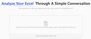
Step 1: Upload Your Files—Excel, CSV, or More
Simply drag and drop your files into Excelmatic. The AI automatically recognizes data structure and types. Supported formats include .xlsx, .xls, .csv, and more. Learn about all supported file types and limits here.
Step 2: Tell the AI What You Need—In Plain Language
No need to select chart types or adjust formatting settings. Describe your needs as if you're talking to a colleague. For example:

Step 3: Generate, Preview, and Export—All in One Click
Within seconds, AI produces a presentation-ready chart. You can export it as an image, embed it into PowerPoint or Notion, or refine the chart further with additional instructions.
Side-by-Side Comparison: AI Charting vs. Manual Charting
| Aspect | Traditional Manual Charting | Excelmatic AI Charting |
|---|---|---|
| Time per Chart | 15-45 minutes | 30-60 seconds |
| Learning Curve | Requires advanced Excel skills | Just describe what you want |
| Multi-Source Support | Complex and error-prone | Automatic merging & alignment |
| Chart Type Matching | Manual trial and error | AI recommends the best fit |
| Format Consistency | Difficult to maintain | Automatically standardized |
| Reusability | Manual updates required each time | Save instructions, regenerate anytime |
FAQ: Your Questions About AI-Powered Charting Answered
Q: What other tasks can Excelmatic handle?
A: Beyond charting, Excelmatic supports data cleaning, merging, calculations, formula generation, and more—completely transforming Excel workflows. Learn more: How to Use AI to Write Excel Formulas
Q: Which chart types are supported?
A: We support bar charts, line charts, pie charts, scatter plots, heatmaps, dashboards, and other advanced visualization types.
Q: How is my data secured?
A: Excelmatic uses enterprise-grade encryption. Your data is processed solely for the task at hand—never stored or shared without consent.
Stop Adjusting Charts. Start Gaining Insights.
Your professional value isn't measured by how well you can fix spreadsheet charts—it's defined by the insights you extract from data. Every hour spent adjusting formats is an hour not spent on strategy.
The era of the "Excel Night Shift" and "data janitor" is officially over. It's time to offload the drudgery and return to the work that actually drives promotions and business growth.
🚀 One Sentence, One Chart, One Second Insight
Upload your data file today and generate your first professional chart with AI.
📊 Generate Your First AI Chart Free
