Key Takeaways:
- The Core Problem: Traditional charts show data but don't tell stories, creating "data-rich but insight-poor" presentations.
- The Communication Gap: The visualization divide between technical and business teams—one understands data, the other understands business context.
- The AI Solution: Excelmatic understands business context to automatically highlight key insights and suggest narrative logic.
- The Value: Transition from "data presenter" to "storyteller," increasing report impact and persuasiveness.
The Scenario: When Beautiful Charts Fail to Answer "So What?"
During the quarterly business review, you present 20 meticulously crafted charts: sales trends, customer distribution, product performance... Each chart is perfectly formatted. But the CEO interrupts: 'Charts look great, but tell us—which market should we focus investment on? Why?' You freeze. The charts showed data, but didn't tell a story.
If you regularly present to non-technical teams or executives, you've experienced this visualization gap. Engineers see data points, marketers see trends, and executives want actionable recommendations. Traditional charting tools help create visuals but don't help build persuasive narratives.
The Old Way: The Manual "Translation" from Data to Insight
Old Way (Manual Data Storytelling):
- Create basic charts: Generate every possible visualization in Excel
- Filter relevance: Manually identify which charts support your argument
- Sequence logic: Rearrange chart order to build narrative flow
- Add annotations: Manually include arrows, text boxes, and highlights
- Write insights: Craft explanatory text for each chart
- Assemble report: Copy charts and text into PowerPoint
- Revise based on feedback: Reorder and refocus based on practice runs
The most painful part is context switching: You're simultaneously a data analyst (understanding data), a communication expert (building stories), and a designer (polishing output). The result is often mediocre performance in all three areas.
The New Era of Smart Storytelling: From "Showing Data" to "Telling Insights"
Excelmatic's data storytelling feature understands business intent, not just data patterns. Instead of creating all charts first and filtering later, you start with the story goal and let AI recommend the most effective visual combination.
Example Story Prompts to Try:
I need to explain to the board why Q4 profits declined. Show: 1) Main cost drivers 2) Competitive comparison 3) Improvement roadmap visualization
Create a customer churn analysis story: Show churn trends, key churn points, recovery opportunities, and retention strategy recommendations
Build a data story for new product launch: Market opportunity size, competitor comparison, projected growth curve, risk warning signals
The Excelmatic Data Story Workflow: Three Simple Steps
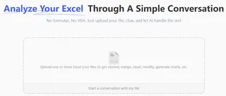
Step 1: Upload Your Raw Materials—Support Multi-Period Comparisons
Upload current data along with historical benchmarks. AI automatically identifies time dimensions, business metrics, and comparability.
Step 2: Describe Your Story Goal—Use Business Language, Not Technical Jargon
Tell AI about your audience and purpose: "Show regional performance differences to motivate underperforming sales teams" or "Demonstrate market expansion feasibility to investors."
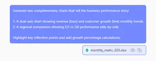
Step 3: Receive Complete Storyboard—Charts + Insights + Recommendations
AI generates more than just charts—it provides logically sequenced visuals, key insight annotations, data-backed recommendations, and even speaking notes.
Watch: See how AI transforms raw data into a complete business narrative with insights and recommendations.
Side-by-Side Comparison: Data Display vs. Data Storytelling
| Dimension | Traditional Chart Creation | Excelmatic Data Storytelling |
|---|---|---|
| Starting Point | Datasets & technical options | Business questions & audience needs |
| Output | Isolated technical charts | Coherent narrative visualizations |
| Focus | Complete data display | Clear insight communication |
| Context | Requires manual addition | Automatically generated explanations |
| Reusability | Start from scratch each time | Story templates are reusable |
| Impact | Depends on presenter skill | Built-in persuasive logic |
| Time Investment | 80% formatting, 20% thinking | 20% instruction, 80% value creation |
FAQ: Your Questions About AI-Powered Data Storytelling
Q: What's the fundamental difference between data stories and regular charts?
A: Regular charts answer "what the data is," while data stories answer "what the data means" and "what we should do." Excelmatic creates these connections by understanding business context.
Q: Can the narrative style be customized?
A: Yes. You can specify tone (motivational, cautionary, analytical), detail level (executive summary vs. detailed report), and focus direction (opportunity-oriented vs. risk-oriented).
Q: What other tasks can Excelmatic handle?
A: You can use Excelmatic to clean data, generate formulas, create dashboard, merge files, and more.
Stop Presenting Data. Start Telling Stories.
Your professional impact isn't measured by how many charts you create, but by how well you communicate what matters. Every minute spent formatting is a minute not spent crafting your message.
The era of disconnected data visualizations is ending. It's time to transform numbers into narratives that inspire action and drive results.
🎯 From Data Presenter to Storyteller
Upload your business data and get a complete data story report in under 3 minutes.
📖 Create My First Data Story
