Key takeaways:
- AI dashboard design redefines dashboards from static reports into interactive decision tools designed for ongoing exploration.
- AI changes traditional design assumptions, requiring dashboards to adapt to evolving questions rather than fixed metrics.
- Effective AI dashboard design relies on clear principles, including designing for questions, progressive disclosure, clarity, and trust.
- A step-by-step design workflow helps teams move from raw data to decision-ready dashboards, typically involving data input, question definition, AI-assisted exploration, visualization refinement, and insight validation.
- Well-designed AI dashboards reduce friction, enabling faster insights and more confident decisions across different business scenarios.
AI dashboard design is not about adding artificial intelligence to charts.
It’s about designing dashboards for a new reality — one where users don’t just view data, but interact with it, question it, and refine their thinking in real time.
As AI-powered dashboard generators become more common, many teams discover that traditional dashboard design principles are no longer enough. To design effective AI dashboards, we need to rethink what dashboards are for — and how people actually use them.
What Is AI Dashboard Design?
AI dashboard design refers to the practice of designing dashboards that support interactive, question-driven data exploration using AI.
Unlike traditional dashboards, which present predefined metrics and static views, AI dashboards are built to respond to user input — often through natural language — and evolve as new questions arise.
The goal is not to display more data, but to reduce the distance between a question and an actionable insight.
Why AI Dashboard Design Is Fundamentally Different
Traditional dashboard design assumes that:
- Key questions are known in advance
- Metrics can be fixed
- Layouts tell a predetermined story
AI dashboards challenge all three assumptions.
In an AI-driven environment, users often start with vague questions, refine them mid-analysis, and change direction based on what they discover. This means dashboards must be designed for exploration, not presentation.
Designing for AI requires flexibility, clarity, and intentional guidance — without overwhelming the user.
Core Principles of Effective AI Dashboard Design
Good AI dashboard design is guided by a small number of strong principles.
1. Design for questions, not charts
The primary unit of interaction is no longer the chart — it’s the question. Dashboards should make it easy to ask, refine, and follow up on questions without restarting the analysis.
2. Progressive disclosure over full visibility
Showing everything at once creates cognitive overload. Effective dashboards reveal information gradually, allowing users to focus on what matters at each step.
3. Clarity beats density
AI can generate a lot of insights quickly. Design must prioritize visual hierarchy and simplicity so users can understand results instantly.
4. Trust is a design requirement
Users need to know where data comes from, what assumptions are being made, and why insights are highlighted. Transparency builds confidence in AI-generated results.
A Practical Step-by-Step AI Dashboard Design Workflow
To make AI dashboard design practical rather than theoretical, it helps to look at a real, working workflow.
The following steps are based on how teams typically design and build AI dashboards using Excelmatic, and they represent a common, effective process for AI dashboard generators in general.

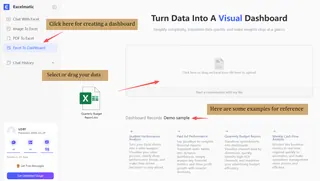
Step 1: Start with real data, not a predefined layout
In Excelmatic, dashboard design begins by uploading existing data — often Excel spreadsheets, CSV files, or exported reports. This reflects a core principle of AI dashboard design: the dashboard should adapt to the data, not force the data into a rigid structure.
Instead of designing charts first, teams focus on making their data available for exploration.
Step 2: Define the business question through conversation
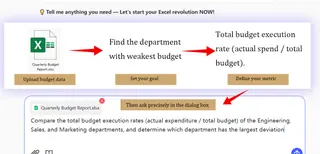
Once the data is loaded, users interact with Excelmatic through natural language. Rather than selecting charts manually, they ask questions such as performance comparisons, trends, or anomalies.
This step represents a key shift in AI dashboard design: questions drive structure. The dashboard begins to take shape based on what users want to understand, not what was assumed in advance.
Step 3: Let the AI generate initial insights and visual structure
Based on user prompts, Excelmatic generates visualizations and analytical views automatically. These are not final dashboards, but starting points — designed to orient users and surface meaningful patterns quickly.
Good AI dashboard design treats this first output as a draft, allowing insights to evolve rather than locking them in.
Step 4: Refine dashboards through iterative exploration
Users can follow up with more questions, adjust time ranges, change dimensions, or request different visual forms without rebuilding anything manually.
This iterative loop — ask, observe, refine — is central to effective AI dashboard design. The dashboard becomes a living interface that responds to thinking, rather than a static artifact.
Step 5: Move from insight to decision-ready views
As understanding deepens, dashboards naturally become more focused. In Excelmatic, teams can arrive at clean, decision-ready views that summarize key insights while still allowing deeper exploration when needed.
At this stage, the dashboard supports action, not just analysis.
Common AI Dashboard Design Mistakes to Avoid
Many AI dashboards fail not because of weak AI, but because of poor design decisions.
Common mistakes include:
- Treating AI dashboards as static reports
- Overloading the interface with metrics
- Hiding assumptions behind black-box insights
- Designing for analysts instead of decision-makers
Avoiding these pitfalls keeps dashboards usable and trustworthy.
From Better Design to Better Decisions
AI dashboard design is ultimately about one thing: making decisions easier.
As questions become more dynamic and data changes faster, static dashboards struggle to keep up. Well-designed AI dashboards shift the focus from maintaining reports to exploring insights — allowing teams to think with data instead of working around it.
This is why AI dashboard generators are becoming essential. When designed properly, they reduce friction, shorten insight cycles, and bring analysis closer to everyday decision-making.
Tools like Excelmatic support this design philosophy by combining familiar spreadsheet inputs with conversational analysis and flexible dashboards — helping teams apply modern AI dashboard design principles without overhauling their existing workflow.
If you want to see how AI dashboards work in practice, Excelmatic offers a range of AI-generated templates and real examples — such as Marketing Dashboards, Sales Dashboards, and Financial Dashboards — to help you understand how different teams design and use dashboards in real scenarios.
Try Excelmatic and experience a more intuitive way to design AI dashboards.
Frequently Asked Questions (FAQ)
Q: What makes a good AI dashboard design?
A: A good AI dashboard design helps users quickly understand what matters, explore data through questions, and trust the insights generated by AI without feeling overwhelmed.
Q: How do AI dashboards support decision-making better than traditional dashboards?
A: AI dashboards support decision-making by allowing users to explore data dynamically, ask follow-up questions, and adapt views in real time instead of relying on fixed reports.
Q: What skills are needed to design AI dashboards?
A: Designing AI dashboards requires understanding user decision needs, basic data concepts, and interaction design principles rather than advanced coding or data engineering skills.
Q: When should a team invest in AI dashboard design?
A: Teams should invest in AI dashboard design when static dashboards slow down insight generation and decisions depend on continuously evolving questions.

