In data analysis, charts are highly effective visualization tools that help us transform complex data into intuitive and easy-to-understand images. For professionals, data visualization is almost a daily routine—whether it's reporting department performance in weekly meetings, analyzing product sales quarterly, or conducting competitor comparisons for leaders, charts are indispensable.
Bar charts, with their intuitive comparison effects, have become a frequent choice. However, creating common charts like bar charts often involves a lot of manual operations, especially when dealing with large amounts of data that require frequent updates. Manually adding labels is not only time-consuming but also prone to errors.
Traditional Manual Process for Creating Bar Charts
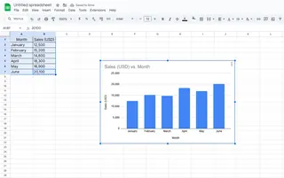
In Excel, creating a bar chart typically involves the following steps:
- Highlight your data (e.g., monthly sales figures).
- Click Insert > Chart.
- In the Chart Editor sidebar, switch to Bar chart under Chart Type.

This method is manageable for small datasets, but for large datasets or bar charts that need frequent updates, manual operations become extremely cumbersome and error-prone. For example, when the data range expands to dozens or even hundreds of data points, clicking to add labels one by one is highly inefficient and prone to missing key data.
Pain Points of Manually Adding Labels
Creating a bar chart itself is not complicated, but adding precise labels to each bar becomes the biggest challenge:
- Low efficiency: When dealing with large datasets, manually adding labels requires clicking on each one individually, which consumes a lot of time.
- Prone to errors: Human operations can easily lead to data omissions or labeling mistakes.
- High maintenance cost: Every time the data changes, the labels need to be manually updated again.
- Inconsistent formatting: Manual operations make it difficult to ensure consistent label formats.
These issues are particularly prominent in business environments. When teams need to generate reports frequently, inefficient labeling processes can become a significant burden and may even delay decision-making.
How AI Tools Solve These Pain Points
Traditional manual methods typically require us to edit chart labels one by one, which is not only time-consuming but also error-prone, especially with large datasets. The tedium of manually adding labels is stealing your time and energy.
Why not try AI tools? Currently, AI can fully meet your data visualization needs. Tools like Excelmatic provide intelligent automation solutions, allowing you to efficiently generate charts and easily handle daily report creation.
How AI Simplifies the Chart Label Addition Process
With Excelmatic, you can quickly generate bar charts and automatically add labels, improving efficiency while ensuring accuracy. The specific steps are as follows:
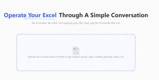
- Upload data

- Describe requirements: Use natural language to describe your needs. For example, "generate a labeled bar chart for the sale "

- Wait for AI processing
Excelmatic uses AI-driven automated chart generation technology, making the entire process extremely simple and saving a lot of time and effort from manual operations.
Advantages of Excelmatic:
- One-click chart generation: No need to manually process data; AI can directly understand your needs and generate the required charts.
- Automatic labeling: AI automatically adds clear and readable labels to the bar chart, eliminating omissions and errors that may occur with manual addition.
- Real-time updates: Once the data changes, Excelmatic automatically updates the chart and labels without the need for tedious re-editing.
Advanced Techniques: How to Enhance the Visualization Effect of Bar Charts
Excelmatic not only automatically adds labels but also provides some advanced techniques to help users further optimize the presentation of bar charts:
- Optimize label formats: Choose different fonts, colors, and sizes to make labels more prominent and suitable for the presentation scenario.
- Dynamic data updates: When data is updated in real-time, the chart labels automatically synchronize without manual adjustments.
- Interactive charts: Excelmatic supports generating interactive charts where users can click to view specific values or compare data.
Summary
The tedious process of manually adding labels often consumes a lot of time and energy. AI tools like Excelmatic can automate data labeling, improving efficiency while ensuring accuracy and consistency.
For users who need to frequently update or handle large-scale data, using AI tools like Excelmatic to generate bar charts and automatically add labels is the best choice to enhance work efficiency and data visualization effects.
If you're still manually editing bar chart labels, why not try Excelmatic and let AI help you save time and improve data visualization effects.


