In every e-commerce store, there are winners—and then there’s everyone else.
You probably have a few top-selling products that dominate the charts. But do you know exactly:
- How much of your revenue they drive?
- How concentrated your sales are?
- If you're too dependent on just a few SKUs?
Excelmatic helps you figure that out with one chart: a clean, visual breakdown of sales by product.
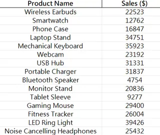
Sample Dataset

Traditional Way = SUMIF Headache
To analyze sales by product in Excel, you usually need to:
- Group data by product name/SKU
- SUM all sales values
- Sort descending, pick Top 5
- Insert pie or Bar Chart
- Format labels, colors, maybe add “Other” group
All that to answer:
Are we relying too much on just 3 products?
Yikes.
With Excelmatic, Just Ask:
Just ask:
Show a pie chart of sales share by product
Display a Bar Chart of top 5 best-selling products
Which product contributed the most to total revenue?

Show total sales by product in a table, sorted descending
In seconds, Excelmatic gives you:
- A colorful breakdown by product
- Percentage of each product’s contribution
- Optional table to dive deeper
- Ability to group small contributors as “Others”
Use Cases
- Identify high-performing SKUs for promotions or bundles
- Evaluate product portfolio risk (over-reliance on few)
- Share clean insights with your suppliers or marketing team
- Spot opportunities in under-performing items
Manual vs Excelmatic AI
| Task | Traditional Excel | Excelmatic AI |
|---|---|---|
| Group & sum by product | Manual functions | Instant |
| Sort by sales | Manual sorting | Built-in |
| Select Top N + others | Custom logic needed | Smart default |
| Build visual chart | Insert + tweak | Auto-generated |
| Time to result | 30–40 mins | < 1 minute |
Pro Tips
- Limit visual to Top 5 or Top 10 products
- Add labels with % of total next to product names
- Consider adding profitability layer in follow-up analysis
- Use color to highlight newly launched SKUs vs long-time bestsellers
Final Words
Sales concentration is powerful—but dangerous.
With Excelmatic, you can uncover your product performance landscape in one chart. Then decide: double down, or diversify?
If you are interested in Excel AI charts, you may also like the following articles:
Compare Ad Channel Sales with a Bar Chart in Excel AI
Track Monthly Sales Trends in Seconds with Excel AI Line Chart
Compare Brand Sales Trends with Multi-Line Chart in Excel AI
Visualize Category Sales by Region with Donut Charts in Excel AI
Compare Seasonal Sales Trends with Multi-Line Excel AI Charts


