Key takeaways:
A dashboard is a unified interface that presents essential metrics from multiple sources to monitor, analyze, and support decisions.
Dashboards help users quickly grasp business state, spot trends/anomalies, monitor KPIs, and act on insights.
Core design principles: understand users; choose the right dashboard type (strategic, analytical, operational); limit to 3-5 key metrics; build a clear visual narrative; pick appropriate chart types; follow consistent UI rules; iterate continuously.
Tools like Excelmatic offer templates and customization to quickly build, test, and iterate effective dashboards.
Every morning, the marketing director receives five different reports: sales, website traffic, ad performance, customer feedback, and inventory. Each report comes from a different system and in a different format, and it takes her nearly an hour to piece together the overall business picture.
This is what dashboards are meant to solve — they consolidate these scattered key data points into a single unified interface, enabling managers to quickly get a holistic view.
This article shares seven core principles of dashboard design, distilled from practical experience, applicable to managers, analysts, and designers. Let's start with the basics and learn step by step how to turn complex data into clear, easy-to-understand visual interfaces.
What is a dashboard?
A dashboard is a data visualization tool that presents key business metrics and data from multiple sources in one unified interface. Just as a car dashboard provides the driver with essential information like speed and fuel level, a data dashboard gives decision-makers a core view of business operations.
Modern dashboards are more than simple data displays — they are comprehensive platforms for information integration, monitoring, analysis, and decision support. They help users to:
- Quickly grasp the overall state of the business
- Identify trends and anomalies
- Monitor key performance indicators
- Make timely, data-driven decisions
A well-designed dashboard can distill the most valuable information from a complex data environment, turning raw data into actionable insights.
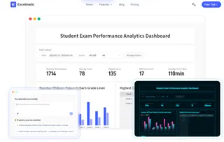
Seven core principles for dashboard design
The quality of a dashboard's design directly affects its effectiveness. A good design should enable users to get the most important information in the shortest possible time and support them in making the right decisions. The following seven principles provide a systematic framework for dashboard design; each addresses specific design challenges and together form the methodological foundation for creating effective dashboards.
1. Start by understanding your users
The starting point for dashboard design should be its users. Different user groups have different information needs and usage scenarios. Senior executives typically need a high-level business overview and key performance indicators; they are interested in trends and outliers, not operational details. Department managers may require more specific data to monitor team performance or project progress. Front-line staff often need real-time data to guide daily operations.
2. Choose the right type of dashboard
Based on user needs, dashboards can be divided into three main types, each with its own design focus and use cases.
Three core dashboard types:
Strategic dashboards
Designed for senior executives, these display enterprise-level key performance indicators. These dashboards usually use a clean, compact layout that highlights goal achievement, overall trends, and exceptions. Data is updated less frequently — daily or weekly. The focus is highly summarized, answering the question "Are we meeting our goals?"Analytical dashboards
Targeted at business analysts and department managers, these provide deeper data exploration capabilities. Analytical dashboards include more dimensions and support drilling down, filtering, and comparisons. The design must balance information density and readability — provide enough detail without overwhelming the interface.Operational dashboards
Used to monitor day-to-day operations and aimed at front-line staff. These emphasize real-time data and actionability, typically including alerting mechanisms and quick-response features. Operational dashboards need to clearly show current status and enable fast identification of issues.
Want to see real-world examples of different dashboard types? Excelmatic offers demos across multiple industries — including sales analysis, operations monitoring, and financial reporting — so you can experience how each dashboard type solves specific business problems.

3. Focus on key metrics
A common mistake is trying to display too many metrics in a limited space. When information overload occurs, important signals get lost in the noise. The effective approach is to rigorously select metrics, ensuring that every data point on the dashboard is directly tied to a business objective or user decision.
Use these criteria when selecting metrics:
- Strategic relevance: Does this metric directly measure a core business objective?
- Actionability: Can users take concrete actions when they see changes?
- Clarity: Is the metric's definition clear and unambiguous?
Follow the "5-second rule": users should be able to identify the most important information within 5 seconds.Typically, keeping core metrics to 3-5 and displaying other supporting metrics on demand is a sensible approach.
4. Build a clear narrative flow
Data is neutral, but when organized logically it can tell a meaningful story. A good dashboard not only shows "what" is happening but also guides users to think about "why" and "what to do."
When crafting the narrative flow, focus on:
- Visual flow: Arrange information according to reading habits — left to right, top to bottom
- Causal relationships: Group related metrics together, for example placing marketing spend next to sales results
- Context: Add time comparisons, target lines, or industry benchmarks to provide reference points for the data
5. Choose appropriate visualization types
Choosing the right chart is key to conveying information effectively. Depending on the type of data relationship you need to show, consider these four chart categories:
Four major chart categories and when to use them:
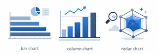
- Comparison charts
These show differences or rankings among items. Use them when comparing multiple categories on the same metric. These charts leverage intuitive length or height differences to help users quickly spot winners, losers, and orderings.
- Bar chart: Compare values across categories; ideal for rankings
- Column chart: Similar to bar charts; often used for time-series comparisons
- Radar chart: Compare performance across multiple dimensions, such as product feature comparisons
 2. Composition charts
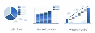
These emphasize the relationship of parts to the whole. Use them to analyze structure and understand each part's relative importance within the whole.
- Pie chart: Shows percentage of total for each part; suitable for fewer than six categories
- Stacked bar chart: Shows total and the composition of its parts simultaneously
- Waterfall chart: Illustrates the cumulative effect of sequential value changes
- Distribution charts
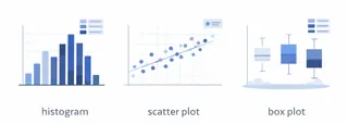
Used to show the distribution characteristics and range of data. Use them when you need to understand central tendency, dispersion, or outliers.
- Histogram: Shows distribution and identifies concentration
- Scatter plot: Displays the relationship and distribution between two variables
- Box plot: Shows median, quartiles, and outliers
- Relationship charts
Focus on the association and trends between variables. These are useful for showing how two or more variables affect each other, identifying patterns, forecasting trends, and exploring causal relationships.
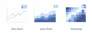
- Line chart: Shows trends and patterns over time
- Area chart: Emphasizes the cumulative effect of trends
- Heatmap: Shows density or correlation
6. Follow basic interface design principles
Clear visual design significantly improves a dashboard's usability. Maintain style consistency.
Clear visual design significantly improves a dashboard's usability. Maintain style consistency — color, typography, and spacing — to help users quickly understand the information structure — color, typography, and spacing — to help users quickly understand the information structure.
Key considerations in implementation:
- Color system: Establish a consistent semantic color scheme, e.g., red for alerts, green for normal
- Layout and typography: Use a grid system to keep elements aligned and balanced
- Text readability: Ensure font sizes and contrast are suitable for the viewing environment
Use whitespace purposefully to separate information groups and reduce cognitive load. Also keep in mind that more users view dashboards on mobile devices, so responsive design is increasingly important.
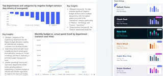
For example, dashboards generated by Excelmatic offer a variety of themes to meet diverse user needs — whether a clean corporate look or a modern tech aesthetic, they ensure professional and consistent visual design.
7. Establish a continuous optimization process
Launching a dashboard doesn't mean the design work is done. On the contrary, it marks the start of ongoing optimization. Business needs evolve, and initial assumptions may need to be adjusted.
Set up the following feedback loops:
- Regularly collect user feedback, focusing on pain points and improvement suggestions
- Analyze usage data to identify the most viewed and most ignored areas
- Conduct a design review each quarter and adjust metrics and layout according to business changes
Implementing a regular review process and iterating the dashboard based on business evolution and user feedback is key to maintaining long-term value.
Conclusion
The ultimate test of a good dashboard is whether it truly helps users understand information more efficiently and accurately, and enables better decisions. From that perspective, dashboard design is always a user-centered, goal-driven, and continuously improving process.
Whether you're just getting started with dashboard design or looking to optimize an existing dashboard, Excelmatic can provide powerful and flexible support. We offer a range of pre-built dashboard templates
Start your dashboard design journey now!
Let us help you turn complex data into clear insights and provide strong data support for your business decisions.
Frequently Asked Questions (FAQ)
Q: How do I know the dashboard is actually helping?
A: Measure time saved (how long tasks take before vs. after), faster decisions, or small KPI improvements. Even simple before/after checks work.
Q: People say the numbers don't match other reports — what do I do?
A: Show the data source and last update on the dashboard, and name the metric owner. That builds trust and makes fixes easier.
Q: I keep getting too many alerts — how can I cut noise?
A: Only alert on meaningful changes (bigger thresholds), group similar alerts, and send them to the people who can act.
Q: How do I keep dashboards consistent across teams?
A: Use simple templates (same colors, fonts, and spacing). Reuse cards and charts so everyone follows the same look.


