Key takeaways:
- Many reporting issues come from manual workflows, static reports, and poor scalability, not from bad data itself.
- Teams often waste time building and maintaining reports, while AI dashboards automate reporting and surface insights faster.
- Tracking too many metrics and relying on static Excel reports hides what matters; AI dashboards prioritize clarity and interactivity.
- By reducing errors and making insights accessible, AI dashboard generators help teams make better, ongoing data-driven decisions.
Reporting is supposed to help teams make better decisions.
In reality, many reports do the opposite — they confuse stakeholders, slow teams down, and hide the insights that actually matter.
Even with modern tools, reporting mistakes are still extremely common, especially for teams relying on spreadsheets and manual dashboards. This is where AI dashboards and AI dashboard generators can make a meaningful difference.
In this article, we’ll break down the most common reporting mistakes teams make — and explain how AI dashboards help fix them.
Mistake #1: Spending Too Much Time Building Reports Instead of Using Them
Many teams spend hours — or even days — building reports manually. Copying data, updating Excel formulas, fixing broken charts, and adjusting layouts often becomes a recurring weekly task.
The result?
• Reports are already outdated when they’re finished
• Teams focus on formatting instead of insights
• Decision-making slows down
How AI dashboards fix this:
AI dashboard generators automate report creation. Instead of manually building charts, AI analyzes the data and generates dashboards instantly, allowing teams to focus on interpreting results rather than preparing reports.
For Excel-based teams, tools like Excelmatic show how existing spreadsheets can be turned into dashboards automatically, without rebuilding reports from scratch.
Mistake #2: Tracking Too Many Metrics Without Clear Priorities
It’s common for dashboards to include dozens of metrics “just in case.” While more data feels safer, it often leads to information overload.
When everything is included:
• Key insights are buried
• Stakeholders don’t know what to focus on
• Reports fail to drive action
How AI dashboards fix this:
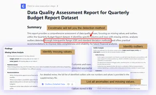
AI dashboards prioritize relevance. By analyzing patterns and trends, AI highlights the most important metrics and changes, helping teams focus on what actually matters instead of everything at once. Tools like Excelmatic can automatically identify and handle outliers and missing values based on a simple instruction from you.
Mistake #3: Static Reports That Don’t Answer Follow-Up Questions
Traditional reports — especially Excel-based ones — are static. Once a report is generated, any new question requires rebuilding charts or exporting new data.
This creates friction:
• Stakeholders can’t explore data on their own
• Analysts become bottlenecks
• Insights are delayed
How AI dashboards fix this:
AI dashboards are dynamic and interactive. Users can explore data, adjust views, and uncover insights without rebuilding reports from scratch, making reporting more flexible and responsive.
Mistake #4: Inconsistent Data and Human Errors
Manual reporting increases the risk of errors. A broken formula, outdated data range, or copy-paste mistake can silently distort results — and decisions based on them.
Common issues include:
• Inconsistent metrics across reports
• Conflicting numbers between teams
• Lack of trust in reporting
How AI dashboards fix this:
AI dashboard generators reduce manual steps, which significantly lowers the risk of human error. By pulling data directly from sources or structured files, AI dashboards help ensure consistency and accuracy.
Mistake #5: Reports That Only Experts Can Understand
Many reports are technically correct — but practically useless to non-technical stakeholders. Complex tables, unclear charts, and unexplained metrics make it hard for decision-makers to extract value.
This often leads to:
• Reports being ignored
• Endless clarification meetings
• Missed opportunities
How AI dashboards fix this:
AI dashboards are designed for clarity. Visual summaries, intuitive charts, and AI-generated insights make reports easier to understand, even for users without data or BI expertise.
Mistake #6: Relying on Excel Alone for Growing Data Needs
Excel is powerful, but as data grows, spreadsheets become harder to manage. Large files, multiple versions, and manual updates don’t scale well.
Teams often struggle with:
• Version control issues
• Slow performance
• Limited visibility into trends
How AI dashboards fix this:
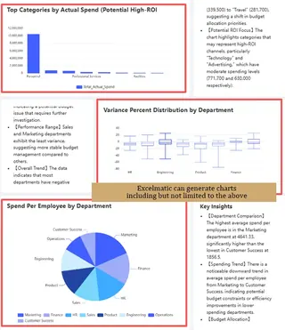
AI dashboards complement Excel rather than replace it. Teams can continue using spreadsheets while tools like Excelmatic transform Excel data into scalable dashboards and AI-generated insights — without adding complex BI systems.
Mistake #7: Treating Reporting as a One-Time Task
Reporting is often treated as a final deliverable instead of an ongoing process. Once the report is delivered, teams move on — until the next reporting cycle.
This mindset limits impact:
• Trends are missed over time
• Insights aren’t continuously refined
• Reporting becomes reactive instead of proactive
How AI dashboards fix this:
AI dashboards support continuous reporting. With real-time or regularly updated data, teams can monitor changes, spot anomalies early, and make ongoing improvements instead of reacting too late.
Why AI Dashboard Generators Are Changing Reporting
AI dashboard generators are not just about automation — they change how teams think about reporting.
Instead of asking:
“How do we build this report?”Teams can ask:
“What is the data telling us right now?”
For Excel-based teams, tools like Excelmatic make this transition especially smooth by turning existing spreadsheets into AI-powered dashboards without heavy setup or technical complexity.
Final Thoughts
Reporting mistakes are rarely caused by bad intentions—they’re caused by manual processes, lim ited tools, and growing data complexity.
AI dashboards help teams avoid these common pitfalls by automating reporting, reducing errors, highlighting what matters, and making insights accessible to everyone.
If your team relies heavily on Excel and reporting still feels slow or fragile, you can try Excelmatic today to see how spreadsheets can be turned into AI-powered dashboards with far less effort.
Frequently Asked Questions (FAQ)
Q: What is the difference between an AI dashboard and a traditional dashboard?
A: Traditional dashboards are usually static and require manual updates. AI dashboards are dynamic and automated, using artificial intelligence to highlight key trends, surface insights, and adapt as new data becomes available.
Q: What are the most common reporting mistakes teams make?
A: The most common reporting mistakes include relying on manual workflows, tracking too many metrics without priorities, using static reports, and depending heavily on spreadsheets that don’t scale. These issues often lead to outdated insights, errors, and slower decision-making.
Q: How do AI dashboards improve reporting accuracy?
A: AI dashboards improve accuracy by reducing manual steps such as copy-pasting data or maintaining complex formulas. By automating data processing and visualization, AI dashboard generators help ensure consistent metrics and minimize human errors.
Q: How do AI dashboards help teams focus on the right metrics?
A: AI dashboards analyze patterns and trends in data to highlight the most relevant metrics, helping teams avoid information overload and focus on insights that drive action

