Key takeaways:
You're Not Alone in This Struggle: Most professionals face the same challenge - you want to use statistical AI solvers but get stuck on technical terms like p-values and confidence intervals
Master Just 6 Key Concepts: Instead of learning complex statistics, focus on these essential terms: training/test data, overfitting, accuracy vs precision, p-values, confidence intervals, and correlation vs causation
See It in Action with Excelmatic: Watch how these concepts come alive when you upload your data and ask plain-English questions like analyzing satisfaction vs performance correlations
No Statistical Background Needed: Tools like Excelmatic let you apply these concepts through simple conversations, making advanced analysis accessible to everyone
You know that feeling? You ask your AI, "Show me what's important in the data."
It gives you a chart and a few numbers. But in your mind, you're thinking about seasonality, predicting next quarter's risks, and identifying your most valuable customer segments. The simple analysis you got back... misses the point entirely.
So you try to ask a more sophisticated question, fumbling with terms you're not entirely sure of. The AI responds, but now it's filled with words like "p-values," "confidence intervals," and "overfitting." You're stuck — unable to articulate the complex question you have, and unable to decipher the complex answer it provides.
This communication gap is what holds most professionals back.
The solution isn't to become a statistician. It's to learn the lingua franca — the essential vocabulary that allows you and your AI to finally understand each other.
This guide bridges that gap. We break down the 6 key statistical terms that will transform your interactions. You'll learn how to ask the questions you truly mean and confidently interpret the answers you receive. Stop settling for simple outputs. Start having the powerful conversations you've been imagining.

Core Concept 1: The Foundation — Data Integrity
Training & Test Data
This concept involves splitting your dataset into two parts: a training set for the AI to learn from, and a separate test set to evaluate its performance.
This is your primary defense against an AI model that works in theory but fails in practice. It answers the critical question: "How well will this model perform on new, unseen data?"
When reviewing your AI's output, always ask: "What's the performance difference between the training and test sets?" A large gap is a major red flag.
Core Concept 2: The Model's Performance — Is It Learning or Memorizing?
Overfitting
Think of overfitting as a modeling error where your AI learns the training data too perfectly. Instead of just capturing the underlying patterns, it ends up memorizing the specific noise and random fluctuations unique to that dataset. This "memorization" means it will struggle with any new data it encounters.
The danger lies in how deceptive this can be. An overfit model appears perfectly accurate during testing, giving you false confidence. But when you actually use it for real predictions, its results become unreliable and could lead to poor business decisions.
To spot this, always ask your AI platform what techniques it uses to prevent overfitting, such as regularization or cross-validation.
Accuracy & Precision
Accuracy measures how often the model's predictions are correct overall. Precision, however, focuses on the reliability of the model's positive predictions.
Consider a spam filter for your email. High accuracy means it correctly identifies most spam emails and correctly allows most non-spam emails to reach your inbox. High precision, on the other hand, means that when it does flag an email as spam, it is almost always correct. A high-precision spam filter has very few "false positives" — legitimate emails mistakenly sent to the junk folder.
Understanding this difference is crucial because the right metric depends entirely on your business goal. In some cases, precision is far more critical than overall accuracy. Maximizing the wrong metric can lead to a model that is technically "accurate" but practically useless or even harmful.
Core Concept 3: Interpreting the Results — What Does It Really Mean?
p-value
A p-value is a measure used to assess the statistical significance of a finding. It answers a specific question: "Assuming there is no real pattern or relationship (the null hypothesis), what is the probability of seeing the result I got, or something more extreme, just by random chance?" A low p-value (typically below 0.05) indicates that the pattern you're observing is unlikely to be a fluke.
Imagine a clinical trial for a new drug. A low p-value would suggest that the observed improvement in patients' health was very likely caused by the drug itself, rather than being the result of random luck, a placebo effect, or other unrelated factors.
This concept matters because it helps you separate the real signals from the random noise in your data. It provides a data-driven way to answer, "Is this finding I'm looking at actually meaningful, or is it just a coincidence that appeared in my specific dataset?"
Confidence Interval
A confidence interval is a range of values, derived from your sample data, that is likely to contain the true value of an unknown population parameter. It's often presented as, "We are 95% confident that the true value is between X and Y."
Think of a weather forecast. Instead of stating, "Tomorrow's high will be exactly 75°F," a more sophisticated and honest forecast says, "We are 95% confident the high will be between 72°F and 78°F." The width of the range tells you a lot — a narrow range indicates high certainty, while a wide range reflects more uncertainty.
This is crucial because it quantifies the uncertainty in your AI's predictions. A single, stark prediction like "10% sales growth" is less informative and can be misleading. A prediction of "10% sales growth, with a 95% confidence interval of 8% to 12%" is far more valuable. This range allows for realistic planning, risk assessment, and setting appropriate expectations.
Correlation vs. Causation
This is perhaps the most important distinction in all of data analysis. Correlation means that two variables move together in a predictable way. Causation means that a change in one variable directly brings about a change in another.
The classic example is the correlation between ice cream sales and drowning incidents. They both increase dramatically during the summer months. Does buying ice cream cause drowning? Of course not. A hidden third factor, the summer heat, causes both: hot weather leads people to both buy more ice cream and swim more often, which in turn leads to more drowning accidents.
AI models are exceptionally good at finding correlations, but they are blind to causation. It falls to you, the human expert with domain knowledge, to critically question whether a strong correlation implies a causal relationship before you invest time and money acting on it.
How to Apply This With an AI Solver: A Step-by-Step Guide Using Your Employee Data
Let's translate theory into practice. Assuming you have this exact employee dataset, your goal is to use Excelmatic to understand and optimize your team management. Here is the precise, conversational workflow you would follow.
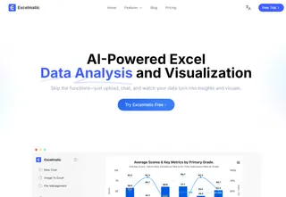
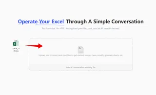
Step 1: Upload Your Data
Simply drag and drop your employee data file into Excelmatic. The platform instantly recognizes your spreadsheet's structure and prepares it for analysis - no setup, formatting, or statistical expertise required.
Step 2: Ask Your Question
Pose this direct question to Excelmatic:
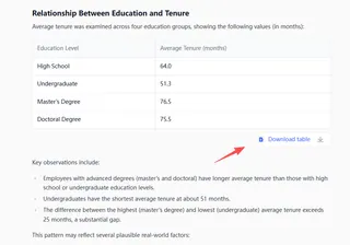
"Analyze whether there is a correlation between satisfaction and performance. Also examine the relationship between education and tenure. Based on business common sense, could these correlations potentially be causal relationships in reality?"
Within seconds, Excelmatic generates a comprehensive report that reveals:
Step 3: Get Your Ready-to-Use Report
Download a professional analysis package may including:
Statistical summary with correlation coefficients and confidence levels
Data visualizations comparing education groups and tenure durations
Business interpretation of what these relationships mean for your organization
Actionable recommendations for focusing retention strategies
This straightforward process transforms raw data into strategic insights in minutes. You're not just getting numbers — you're getting a clear, evidence-based understanding of what truly drives employee retention and performance in your organization.
By following this conversational workflow with Excelmatic, you move from a static spreadsheet to a dynamic, evidence-based dialogue with your data. This process ensures you are not just getting answers, but are equipped to question them, understand their limitations.
Frequently Asked Questions (FAQ)
Q: I'm not a statistician, can I really understand these statistical terms?
A: Absolutely. Think of these 6 terms as essential phrases in a new language, not a full statistics course. Tools like Excelmatic are designed specifically for non-experts, letting you apply these concepts through simple conversations rather than complex calculations.
Q: Why do I need to know these terms if the AI does the analysis for me?
A: Knowing these terms transforms you from passively receiving outputs to actively guiding the analysis. You'll be able to ask better questions, spot potential errors (like overfitting), and understand when to trust the results versus when to dig deeper.
Q: Can I really have a meaningful conversation with an AI about statistics?
A: Yes, when you speak the right language. These 6 terms provide the vocabulary for productive dialogues where you understand the answers and can ask intelligent follow-up questions.
Wrap Up: Let's Bring This All Together
Learning these 6 statistical terms isn't about becoming a data scientist — it's about becoming a better communicator. Think of it like learning key phrases before traveling to a new country. You don't need to be fluent, but knowing the right words helps you get where you want to go.
These concepts — training vs test data, overfitting, accuracy vs precision, p-values, confidence intervals, and correlation vs causation—are your essential travel phrases for the world of AI. They help you ask better questions and understand what your AI is really telling you.
Ready to Start Your Conversation?
Now that you understand the language, it's time to start speaking it. With Excelmatic, you don't need to worry about complex formulas or statistical software. You can simply have a conversation with your data, using the terms we've covered in the most natural way possible.
Why keep struggling with confusing outputs when you can have clear, productive conversations with your data?
Take Excelmatic for a test drive today. It's free to start, and you might be surprised how quickly you'll be having the data conversations you've always wanted.
Your data has stories to tell. With Excelmatic, you'll finally understand what they're saying.

