Key takeaways:
- Core Purpose: Data visualization turns raw data into actionable insights for faster, more confident decisions.
- Essential Toolkit: 12 key chart types serve specific analysis needs—from trends (line charts) to comparisons (bar charts) and proportions (pie charts).
- Practical Use: Each chart type aligns with real business scenarios like sales analysis, performance tracking, and conversion monitoring.
- Efficiency Gap: Manual chart creation in Excel is slow and prone to errors, hindering data-driven workflows.
- AI Solution: Tools like Excelmatic automate visualization and dashboard building, letting teams focus on insights over manual formatting.
In today's fast-paced business environment, professionals are often overwhelmed by the sheer volume of data at their disposal. Endless spreadsheets make it difficult to identify trends, spot anomalies, or make timely decisions. Whether it's tracking sales, monitoring customer engagement, or evaluating operational performance, one challenge remains consistent: how to transform raw numbers into actionable insights without spending hours formatting charts or building dashboards manually.
Data visualization is the answer. By turning your data into clear, intuitive visuals, you can quickly recognize patterns, communicate insights effectively, and make decisions with confidence. Below, we explore 12 essential types of data visualizations, what they are, what they're best suited for, and where they excel in real-world scenarios.
12 Types of Data Visualizations Every Professional Should Know
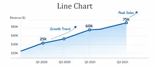
1. Line Chart
Definition: Line charts connect a series of data points with a line to show how values change over time or sequence. They are one of the most common tools for trend analysis, revealing increases, decreases, or fluctuations clearly.
Best for: Displaying time series data, continuous metrics, or growth and decline trends. They are particularly effective for observing overall direction or cyclical patterns.
Typical scenarios: Monthly sales trend analysis, website traffic fluctuations, stock price movements, annual customer growth tracking.
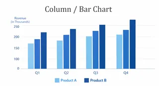
2. Column / Bar Chart
Definition: Column and bar charts use rectangular bars to represent the size of different categories or items, making it easy to compare values across groups.
Best for: Highlighting differences or proportions among categories, clearly showing which categories lead or lag.
Typical scenarios: Comparing sales across regions or channels, department performance ranking, product line sales, customer segment distribution.
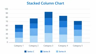
3. Stacked Column Chart
Definition: Stacked column charts layer multiple subcategories within each column using colors or segments, illustrating both total values and their composition.
Best for: Showing total values along with the contribution of each component, particularly useful when you want to highlight structural changes over time or between categories.
Typical scenarios: Quarterly sales broken down by product line, budget allocation by department, user acquisition channel distribution, project milestone tracking.
4. Pie Chart
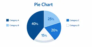
Definition: Pie charts display proportions of a whole as slices of a circle, making relative comparisons immediate and intuitive.
Best for: Visualizing part-to-whole relationships, especially when the number of categories is limited.
Typical scenarios: Market share analysis, cost structure visualization, customer segmentation, channel contribution ratios.
5. Area Chart
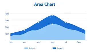
Definition: Area charts fill the space beneath a line, emphasizing total value and changes over time. They combine trend and volume to provide a richer perspective than a simple line chart.
Best for: Cumulative data, trends over time, and comparing multiple categories' contributions to a total.
Typical scenarios: Cumulative sales tracking, website visit accumulation, financial expenditure trends, energy consumption over time.
6. Scatter Plot
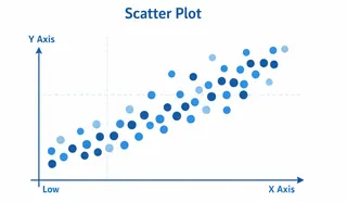
Definition: Scatter plots display individual data points on a coordinate plane to reveal relationships between two or more variables, making patterns and outliers visible.
Best for: Examining correlations, distributions, anomalies, or trend relationships between variables.
Typical scenarios: Marketing spend vs. revenue analysis, customer age vs. purchase behavior, experimental data correlation, product performance evaluation.
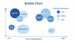
7. Bubble Chart
Definition: Bubble charts extend scatter plots by using bubble size as a third dimension, providing a more nuanced, multidimensional view of the data.
Best for: Analyzing three variables simultaneously, showing size, scale, and relationship in one visualization.
Typical scenarios: Market potential assessment (sales, customer count, profit), project portfolio analysis, product performance vs. market feedback.
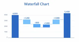
8. Waterfall Chart
Definition: Waterfall charts display how an initial value is affected by a series of positive and negative changes, illustrating cumulative impact on the final total.
Best for: Understanding sequential changes in totals, contributions of individual components, and net variation in financial or operational data.
Typical scenarios: Revenue breakdowns, cost deductions, budget adjustments, profit variation analysis.
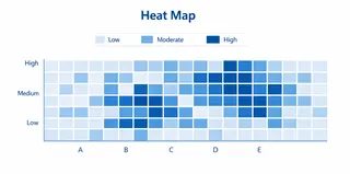
9. Heat Map
Definition: Heat maps use color intensity to represent value magnitude, allowing immediate recognition of high or low activity areas and patterns.
Best for: Showing data distribution, density, trends, and spotting outliers quickly.
Typical scenarios: Website click mapping, sales density analysis, performance monitoring, inventory location analysis.
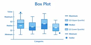
10. Box Plot
Definition: Box plots summarize a dataset's distribution, including median, quartiles, extremes, and outliers, providing a comprehensive snapshot of variability.
Best for: Understanding central tendency, spread, and outliers, and comparing distributions across groups.
Typical scenarios: Employee salary distributions, experimental data variance, customer rating analysis, product performance variation.
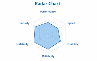
11. Radar Chart
Definition: Radar charts display multivariate data on axes radiating from a center point, enabling comparison across multiple variables to visualize profiles, strengths, and weaknesses in one view.
Best for: Comparing performance or attributes across several dimensions for different items, highlighting strengths and weaknesses in multi-criteria analysis.
Typical scenarios: Employee skill assessment across competencies, product feature comparison, supplier evaluation, and tracking performance across business areas.
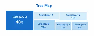
12. Tree Map
Definition: Tree maps use nested rectangles to display hierarchical data, combining size and color to show structure and proportion.
Best for: Visualizing complex, layered data structures and relative contributions at different levels.
Typical scenarios: Product category sales share, budget distribution across departments, organizational structure, market share segmentation.
The Challenges of Creating Data Visualizations in Traditional Excel
While Excel provides the tools to create these visualizations, building them manually is often tedious and error-prone. Adjusting ranges, formatting axes, aligning labels, and combining multiple charts into a single dashboard requires meticulous effort. The process can slow decision-making and reduce analytical efficiency, particularly for teams managing large or frequently updated datasets.
How Excelmatic Simplifies Data Visualizations Creation
Excelmatic transforms this workflow by letting you generate these charts instantly from your existing Excel data. You can create line charts, scatter plots, heat maps, and all 12 visualization types without manual formatting or complex formulas.
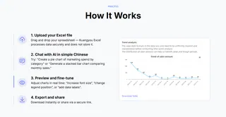
Beyond individual charts, Excelmatic enables you to integrate multiple visualizations into dynamic dashboards. Whether performing in-depth data analysis or presenting key metrics to stakeholders, these dashboards are interactive, customizable, and immediately actionable.
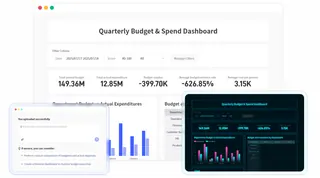
With Excelmatic, teams can focus on interpreting insights and making decisions instead of wrestling with formatting and formulas. By streamlining visualization, Excelmatic empowers data-driven workflows and accelerates decision-making across any organization.
Turn Your Excel Data Into Actionable Insights with Excelmatic
Data visualization is no longer a luxury — it's essential for turning complex spreadsheets into actionable insights. From trend analysis to process tracking, the 12 chart types above can transform how you understand and communicate your data.
Stop spending hours manually formatting charts and building dashboards. With Excelmatic, you can generate professional visualizations and integrated dashboards instantly, letting you focus on insights, not setup.
Start using Excelmatic to liberate your data visualisation!
Frequently Asked Questions (FAQ)
Q1: What are data visualizations?
A1: Data visualizations are graphical representations of data designed to make patterns, trends, and insights easier to understand and communicate.
Q2: Why should professionals use different types of charts?
A2: Each chart type highlights different aspects of the data, such as trends, comparisons, distributions, or hierarchical relationships, enabling better decision-making.
Q3: Can these 12 types of visualizations be created in Excel?
A3: Yes, Excel supports all 12 types, but manual creation can be slow. Excelmatic automates the process and helps integrate charts into dashboards quickly.
Q4: How can Excelmatic help with data visualization?
A4: Excelmatic allows professionals to generate charts instantly, combine multiple visualizations into dashboards, and focus on insights rather than formatting or formulas.

