Key takeaways:
- Core Benefit: AI Dashboard Generators automate manual work, letting you create dashboards in minutes by simply asking questions in plain English.
- The Top 10 Tools (2025): The reviewed tools include Excelmatic, Polymer, Bricks (spreadsheet-like), ClickUp, Mokkup.ai, Supadash, BlazeSQL, Onvo AI, Dashboard AI , and Spotfire .
- How to Choose: Your decision should hinge on three questions: How much time will your team spend learning it? Do you need one-off reports or live monitoring? Is your budget for trying or investing?
- Recommended Starting Point: For most teams, beginning with a zero-learning-curve tool (e.g., Excelmatic) is the fastest, lowest-risk way to validate if AI-driven dashboards solve your core reporting needs.
Modern companies are drowning in data but hungry for insight. According to Forrester, data workers spend on average more than 40% of their time on data wrangling and report prep, not on actual analysis.
The problem isn't a lack of data. It's the fundamental bottleneck of traditional workflows: manual processes are slow and error-prone, tools have high entry barriers, and static reports can't keep up with fast-changing business needs. By the time a marketing team waits a week to get last month's sales analysis, the opportunity has often slipped away.
This is the context in which AI Dashboard Generators appear — not an incremental improvement, but a paradigm shift in how work gets done.
What is an AI Dashboard Generator?
Put simply, an AI Dashboard Generator is a class of tools that use artificial intelligence (especially large language models) to automatically turn raw data into interactive visual dashboards.
But their real value goes far beyond "automating chart creation." They address three core pain points:
- Lowering the technical barrier: no SQL or coding required; ask questions in natural language.
- Massively improving efficiency: compresses days of work into minutes.
- Enhancing decision quality: uses intelligent pattern detection to surface trends and anomalies the human eye might miss.
A true AI dashboard generator should have semantic understanding (grasping your business question), data-intelligent parsing (automatically identifying metrics and dimensions), and visualization-intelligent matching (selecting the best chart to tell the data story).
Dashboard Examples Collection
- Marketing Dashboard: Real-time monitoring of advertising performance, channel conversion, and user behavior
- Financial Dashboard: Visualization of cash flow tracking, budget execution, and income-expense analysis
- Sales Analytics Dashboard: Performance tracking, customer distribution mapping, and product sales trends
- HR Dashboard: Employee performance, recruitment efficiency, and organizational health metrics
- Executive Strategy Dashboard: Company-wide key indicators, business health overview, and early warnings
- KPI Dashboard: Centralized display and dynamic tracking of cross-departmental key performance indicators
- Report Dashboard: Automatically generated interactive data reports with multi-dimensional filtering and drill-down analysis
Top 10 AI Dashboard Generator tools — panoramic review
With so many options, how do you find the right tool for your business? Here are 10 standout AI dashboard generators on the market today, each with a distinct positioning:
| Tool | Core positioning / Use case | Key features | Pricing model |
|---|---|---|---|
| Excelmatic | Minimal, conversational AI dashboard generation | Three-step natural language flow, zero learning curve, AI-driven edits | Free trial + subscription |
| Polymer | AI-powered data visualization | Drag-and-drop interface, auto-generated insight explanations, rich templates | Free tier + subscription |
| Bricks | Spreadsheet-first data visualization | Spreadsheet-like interface, automatic data cleaning, multi-format presentation | Free tier + subscription |
| ClickUp | AI dashboards + workflow management | AI-guided setup, voice input, deep task & automation integrations | Free tier + enterprise plans |
| Mokkup.ai | Customizable BI dashboard design | 180+ templates, one-click export to BI tools, collaborative design | Free tier + subscription |
| Supadash | Fast real-time data visualization | Real-time monitoring, visual query builder, quick deployment | Free tier + subscription |
| BlazeSQL | AI-driven SQL queries & visualization | Natural language to SQL, multi-database support, enterprise security | Subscription |
| Onvo AI | Intuitive AI-driven dashboards | Natural language queries, multilingual support, easy API embedding | Subscription |
| Dashboard AI | Design-first dashboard generation | Generate code from images, community template library | Free credits + pay-as-you-go |
| Spotfire | Advanced visualization & geospatial analysis | Geospatial analytics, real-time streams, extensibility | Custom enterprise pricing |
In-depth analysis of the top 10 AI data visualization tools
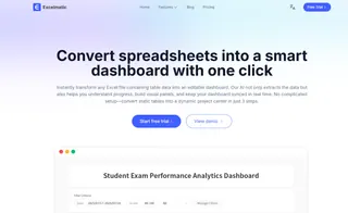
1. Excelmatic
Positioning: A minimalist, conversational AI dashboard generator for non-technical business users.
Core value: It lowers the bar for creating data reports — no complex operations to learn. Describe your needs like a chat, and get a usable professional dashboard in minutes.
Main features:
- Simple three-step flow: The core experience centers on “upload, ask, get.” The UI is clean, with no distracting options.
- Truly natural language interaction: No special syntax or keywords required. Use everyday language (e.g., “compare regional sales by quarter”) and the AI accurately understands intent and generates the matching charts.
- AI-driven iterative edits: It's not just about initial generation. Subsequent adjustments (changing chart types, highlighting specific data) are done through ongoing conversation, enabling end-to-end AI-assisted workflows.
- Best fit: Marketers, ops, sales, managers who need frequent reports but don't want or have time to learn traditional BI tools, and early-stage teams validating ideas quickly.
2. Dashboard AI (by Prototypr.ai)
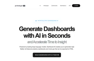
Positioning: A design-prototype tool aimed at designers and product managers.
Core value: Rapidly turns mockups or text descriptions into interactive dashboard front-end code, speeding up the design-to-prototype cycle.
Main features: The flagship capability is “design to code” — upload UI mockups and generate front-end code. It also includes a community marketplace for shared design assets.
Best fit: UI/UX designers and product teams who need high-fidelity, interactive dashboard prototypes for product ideation or client demos.
3. Polymer AI Dashboard Generator
Positioning: A business-user-friendly tool for data exploration and visualization.
Core value: Lets non-technical users turn data into explanatory, interactive dashboards via drag-and-drop and simple questions.
Main features: Intuitive interface with industry templates. Notably, it auto-generates text explanations for created charts, helping users understand the story behind the data.
Best fit: Business teams in marketing, sales, and operations who want to analyze data and produce polished reports independently and quickly.

4. Bricks AI Dashboard Creator
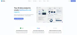
Positioning: A hybrid tool combining the flexibility of spreadsheets with BI visualization power.
Core value: Offers spreadsheet users a smarter upgrade — do advanced analysis in a familiar interface.
Main features: Spreadsheet-like UI (similar to Excel/Google Sheets) with built-in data cleaning, visualization, and AI insight features. Can export dashboards to slides with one click.
Best fit: Data analysts and heavy spreadsheet users who want a flexible environment that spans data prep to visualization.
5. ClickUp
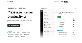
Positioning: An integrated work management platform with built-in AI dashboard functionality.
Core value: Ties insights to tasks, goals, and docs so dashboards become a living part of the workflow — not just static reports.
Main features: The AI assistant “ClickUp Brain” offers dashboard setup suggestions, while “Brain Max” supports dashboard creation and edits via voice input. Strong automation keeps dashboard data in sync with work progress.
Best fit: Teams already using or planning to use ClickUp for project management and who want real-time, actionable insights inside their work platform.
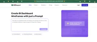
6. Mokkup.ai
Positioning: A dashboard wireframing tool targeted at Power BI and Tableau users.
Core value: Quickly design, preview, and validate BI dashboard layouts before development to avoid rework.
Main features: Large template and component library; one-click export to Power BI or Tableau for continued development. Serves as the “design bridge” in professional BI workflows.
Best fit: BI developers and analysts who need to prototype visuals and confirm layout and style before building complex enterprise dashboards.
7. Supadash
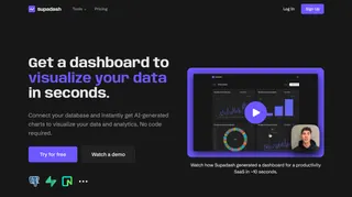
Positioning: A lightweight dashboard focused on real-time monitoring, often integrated with tools like PostHog.
Core value: Provides product and growth teams an ultra-fast way to visualize key user-behavior metrics and product data.
Main features: After connecting data sources, it can generate initial charts in seconds. Its PostHog integration is a standout feature for product analytics.
Best fit: Product managers and growth teams who need to rapidly create and monitor user-behavior KPIs in real time.
8. BlazeSQL
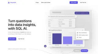
Positioning: An AI query and visualization tool for users who work with SQL.
Core value: Converts natural language into SQL and visualizes results immediately---without losing direct database control or enterprise security.
Main features: Supports most common SQL databases, offers enterprise deployment options and white-label embedding, and suits internal platform integrations.
Best fit: Technical teams and data engineers comfortable with SQL, who want AI to speed queries while maintaining security and control.
9. Onvo AI
Positioning: An API-first dashboard solution focused on developer experience and ease of integration.
Core value: Lets dev teams embed full-featured, customizable dashboards into their SaaS products or internal tools with simple API calls.
Main features: Clean SDKs and APIs, multi-language support, and a focus on lowering integration complexity while keeping functionality robust.
Best fit: SaaS companies or developer teams that want to embed analytics features into their products or quickly build internal data platforms.

10. Spotfire by TIBCO
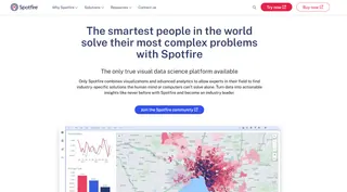
Positioning: A professional-grade visualization and analytics platform for large enterprises with complex needs.
Core value: Handles massive datasets and offers advanced analytics (like predictive modeling and geospatial analysis) with extensive extensibility.
Main features: Powerful capabilities for real-time stream analysis, advanced statistics, and geospatial visualization. Supports R, Python, and JavaScript for deep customization.
Best fit: Large enterprises in finance, energy, manufacturing, and similar sectors that need to run complex analyses, explore deeply, and make mission-critical decisions.
How to choose an AI Dashboard Generator: three decisive questions
With ten options in front of you, the worst mistake is getting lost in feature-comparison tables. More features don't automatically mean a better fit.
Choosing can be simpler than you think. Before you browse vendor sites or request trials, honestly answer these three questions. The right choice will reveal itself.
Question 1: How much time are you and your team willing to spend learning a new tool?
This is the golden rule. It directly affects adoption and outcomes.
If your answer is “almost none — I want it to work immediately”: you need “intuitive,” not “most powerful.” Your ideal tool should feel like Excelmatic: open it and you know what to click; ask questions by chatting and get results. Any product that requires a 20-minute tutorial or understanding “data models” and “measures” is the wrong fit.
If your answer is “we can invest some time if it fits seamlessly into our workflow”: look for tools that embed into what you already use. If your team already manages work in ClickUp, its dashboard is an obvious choice; if your data lives in Snowflake, a tool with direct SQL connections and complex permission controls like BlazeSQL makes more sense.
If your answer is “we're willing to learn to solve complex, specialized problems”: then consider enterprise-grade platforms like Spotfire. Powerful, but with a steep learning curve and higher cost.
Question 2: What is your primary analysis scenario? One-off reports or continuous monitoring?
A tool's value depends on how well it fits into your daily rhythm.
If you often need to analyze new data for one-off reports or presentations, speed is your priority. Lightweight tools that let you get started immediately — Excelmatic (conversational), Polymer (drag-and-drop), or Bricks (spreadsheet-like) — are strong choices.
If you need an always-on “business control panel” that updates automatically, prioritize tools that can connect continuously to your databases and systems (e.g., Supadash with PostHog) and meet your refresh frequency needs.
Question 3: Is your budget "trial first" or "strategic investment"?
This determines your options and risk tolerance.
“I want to try low-cost and solve the immediate problem”: start with tools that offer a solid free tier. Test them with real data to see which produces usable charts without training. Many of the tools listed provide free levels — an effective way to lower risk.
“This is a core investment in decision efficiency”: focus on security, integration, and vendor support. If you need embedded dashboards, evaluate Onvo AI's API; if you have strict compliance needs, ask about enterprise deployments from BlazeSQL or Spotfire.
If you're still undecided, here's a fail-safe starter strategy:
First, try a tool like Excelmatic that centers on "zero learning curve."
Why start with Excelmatic?
For most teams trying AI dashboards for the first time, the biggest risk isn't picking the wrong tool; it's spending too much time learning a complex tool only to find its interaction model doesn't match team habits — and then the project stalls.
A pragmatic approach is to begin where trial costs are lowest and validation is fastest. Excelmatic is an ideal starting point because it reduces the choice to one quick test: “Can I, by natural language conversation alone, get a usable analysis in minutes?”
Summary and action guide: start your AI-driven analysis now
We've reviewed many AI dashboard generators, and they all point to the same future: everyone talking to data directly and getting insights fast.
The key is to pick the starting point that matches your team's current capabilities and needs — not necessarily the most feature-rich tool.
Now is the time to turn insight into action. Instead of endlessly weighing choices, try the most straightforward path. Open Excelmatic, upload a dataset you already have, and ask one business question you've been meaning to answer. See how much difference a clear, usable answer in minutes can make for you and your team.
Try Excelmatic now to create your first AI dashboard
The future of data-driven decision-making is here, and the best way to start is now.
Frequently Asked Questions (FAQ)
Q: What exactly can an AI Dashboard Generator do for me?
A: It acts as an automated data analyst. You upload a spreadsheet or connect a data source, ask a business question in plain language (e.g., "Show sales trends by region"), and it automatically generates an interactive dashboard with the correct charts and insights in minutes.
Q: Can I customize the dashboards created by AI, or am I stuck with its output?
A: Yes, customization is a key feature. Most tools allow you to refine the AI's work. In conversational tools, you can ask follow-up questions to change chart types or focus. In editor-based tools, you can drag and drop elements, apply branding, and add custom calculations.
Q: What's the biggest mistake people make when choosing one of these tools?
A: Overbuying. The most common error is selecting a feature-rich, complex enterprise platform when the team's actual need is simply to get faster answers from occasional data files. This leads to high cost and low adoption. The best strategy is to start with the simplest tool that meets 80% of your needs.

